Monday, November 20, 2023

Writing from Reality 01-The craziest places to get story ideas and character designs at the most random places imaginable?

Wanna hear something Crazy? 

You can actually find things in your area like your home town or maybe references from cartoons just to help your creative side.

Yeah, Life is weird but so is finding random amenities that lead to great story ideas or even character creation.


Here are a few to list:

George Liquor-American!!(A.K.A The man with the liquor store name from Van Nuys)

Everybody has a family member who has a no nonsense attitude or they like nonsense but at the same time, has a strong belief in hyper masculinity.

John K's George Liquor actually borrows heavily from his late father Michael Kricfalusi who was a hyper masculine Canadian male who believed that the breadwinner should be manly. The man tried to get John to stop drawing cartoons and even force him to stop watching them but alas, he failed but what he did get was someone who moved to California, USA and whined about 80's Saturday Morning Cartoons and his lack of pure masculinity.

I wish I had a father like that but my father never acted like that. Instead, my parents separated and and my mother smothered me. She tried to censor my viewing habits and other things I'm not going to get into....


Anyway, back to George Liquor, the guy's name is taken from a random sighting of a broken signage for a Liquor Store in Van Nuys, California in 1979.

"AHHHHHHH!!!! GEORGE LIQUOR!!!!"

How's that for a character who's goddamn personality comes from a creator's father's demeanor. However, John K made this character ultra-conservative but I don't know what political affiliation his father was. 

And he's not going to like this: His favorite hero KIRK DOUGLAS actually was a DEMOCRAT.

So much for trying to emulate your favorite actor, only to realize he's a democrat but not a republican.


The Cosmic Owl from Adventure Time, where did he come from?

Well, I read an article on a July 2012 issue of Nintendo Power that Adventure Time creator Pendleton Ward actually was inspired by a certain reflection from a Bathroom Urinal and it emitted an interesting reflection that looked like a face or a mask. That's how it gave birth to the Cosmic Owl.


But wait, there's more:

What about Ren and Stimpy?


Well, they actually come from two sources.

Stimpy's design was based on the two cats from the 1945 Looney Tunes cartoon A GRUESOME TWOSOME.

The red cat in particular inspired the design of Stimpy due to the hands and the bulbous nose which John K stated was sort of a throwback to 1930s animation where due to the cartoons being produced in Black & White or Two-Strip Technicolor, characters like Mickey Mouse or Sylvester needed gloves so it's easy for audiences to see their hands. 

The bulbous noses are sort of something that some characters had but no longer do unless you're drawing cat characters.


Ren Hoek however was not based on anything cartoon related but instead, his design was based off an old photograph by Elliot Erwitt.

You can imagine how pissed off that Chihuahua looked having been forced to wear such an embarrassing sweater.

Ren's voice, if you can hear it in your head, will always have that Peter Lorre impression regardless if there's an accent or not.


Homer Simpson and Peter Griffin have two things in common with each other, Their voices are actually based on real-life people.... well sort of.

Homer's voice(He's always been voiced by Dan Castellaneta) was based on Walter Matthau so if you watch the Tracey Ullman Shorts and Season 1 of THE SIMPSONS, that's Castellaneta's impersonation of Matthau. However, the Matthau voice proved to be problematic for Castellaneta's vocal chords to the point he eventually dropped the voice in Season 2 and went for something more boisterous.

Peter Griffin's voice on the other hand was based on a security guard that Seth Macfarlane heard when he was studying animation at RISD. He originally used that voice for an earlier character named Larry Cummings in his thesis film THE LIFE OF LARRY and later LARRY & STEVE.

And here's another crazy inspiration fact:


Boomhauer's voice was based on an old voicemail that Mike Judge got back in the mid-1990s.
The voice was allegedly from what he described as a deranged hillbilly but from what the message sounded like, the deranged hillbilly was one who preferred high culture and didn't appreciate the low-brow nature of Beavis and Butthead and left a diatribe on Judge's answering machine. On top of that, he thought the name of the show was PORKY'S BUTTHOLE!!!

"I'VE BEEN CALLING YA'LL FOR ABOUT A MONTH NOW GRIPING ABOUT YA'LL THEM TIME THAT DANG OLE LOONEY TUNES COME ON YA'LL PUT ON THEM 
PORKY'S FREAKING OLE BUTTHOLE!!!"
"I GUESS IMMA HAVE TO CALL FCC ABOUT SHUTTING YA'LLS BUTT DOWN!!!"

The absurdity of that phone call is enough to split your stomach from laughter.

What about my experiences when I created my characters?

This character who I've named Butch Sutherland is based on two things.
His personality and voice is based on Roger Klotz from Doug. The part where this guy bullies the protagonist but proves to be a walking irony and later befriends the protagonist.

Butch also is based on this guy I knew from childhood who at first hated my guts but soon warmed up to me and we became to be good friends. I won't mention his name though.

The shirt design is soft of based upon that vintage 1970s Zenith Advertising design because why not.


This Japanese Girl I drew is actually based on this Asian Girl I knew from high school who I've always had a crush on. We actually were very good friends but I haven't been speaking to her for the last 7 years since my high school graduation.

This character was originally named Tippi but her name is now Megumi. The hair is sort of a mix of 1960's front hair design that I really appreciate but I will admit it did bring challenges to create side profiles of this character.

I have other character design amenities but I didn't copy everything I had on my custom built PC to my USB stick just to create this blogpost. Hopefully, I'll get everything I have and continue this in a part two to this blogpost.


Update as of May 12 2024:
9 Days after I posted this blogpost, Elliot Erwitt passed away at the age of 95. I was shocked but I guess it was his time.

R.I.P Elliot Erwitt.

Friday, November 17, 2023

Proof that early character art look better than the final version

You read articles, watch Blu-Ray Featurettes, read other blogposts, look at concept art from your favorite show, video game, etc.

I'm often fascinated by all the concept art I see of characters from before their final design but I also delight in people saying that pre-production art looks 10 times better than what they actually look like in the final product.

Believe me, I've seen them, and I save the images or take photos using my iPhone and now I'm going to show you what I truly see in Pre-Production character art before the final designs are approved.


Look at how Bernard looks in this photo. He looks much thinner and more insecure than he is in the final product.
 Looks like something that Woody Allen would have portrayed but instead, Allen would portray an ant in 1998.... 
And the role of Bernard would ultimately go to Bob Newhart.


I really like this pre-production art of Miss Bianca. Would have been better if they kept this artwork instead of portraying a half-naked mouse with nothing but a scarf and hat.

But what I really like about this design is how it predicts the rise of Anime Influence in alot of modern American artists. This looks like Fanart to me but who knows, maybe this is actual production art.
Of course, even if this design was approved, Eva Gabor would still fit for this design. If only Rescuers used Dolby Technology for sound instead of RCA PHOTOPHONE.


Early Sheridan College Era 1978 Stimpy according to John K.
He has stated that when he drew Stimpy, the titular Manx cat was drawn to be way more retarded than the Stimpy we now know and love.


But, yeah, just like with Doug being forced by Nickelodeon to have eyebrows, the upper brass at the Slime Factory demanded Stimpy have normal eyes and a slightly higher intelligence though they did allow the mouth to remain the same.
Not all the time though.


Fun Fact: Did you know that Stimpy's design was inspired by the two cats from the 1945 cartoon "Gruesome Twosome"?


Alvin and the Chipmunks, as well as dad Dave Seville look way better in their original 1961 THE ALVIN SHOW designs. I don't get why when people talk about Alvin, they only care about the 80's incarnation.
No, Dave Seville is not puppet rigged, this is actually how he looked back in 1961 but I will say, if Ross Bagdasarian wants to revive Alvin with 2D Animation and puppet rigs, just stick to the 1961 designs since their easy enough to reference for puppet construction.


I like Darth Vader the way he is designed but stop and look at Ralph Macquarie's design of the dark lord below. Look how more menacing his helmet was.
To a point that Star Wars Rebels would actually reference the helmet when they designed Darth Vader's 3d model.

Kazuhiko Katō(AKA MONKEY PUNCH)'s original Chaotic Evil Arsene Lupin III.
Totally would prefer this design of Lupin over the more toned down versions seen in the various anime and publicity material I've seen of this thief.


Ok Ok. So maybe I'm glorifying in character art that look better than the final product but sometimes, there are character art that actually benefit from being designed over and over again.

DOUG is one example.
He just looks odd without eyebrows like he's a non-verbal or something.
When Billy West was casted, Doug had to gain eyebrows so he can actually emote. There were several Season 1 episodes that forget to add eyebrows on Doug and he just looked odd without them. Thank balls he has eyebrows.
You'll also notice that compared to his later Disney incarnation, Doug's scalp is also much rounder and vertically symmetrical....Though there is that one Season 1 episode from the Nickelodeon era where flat scalped Doug did slip up from time to time.
Totally loving that Side Profile Closeup of Patti Mayonnaise.

So why flatten the scalp? Well my guess is that to age up the character but not change anything majorly about Doug was to flatten the scalp and make him slightly more lankier. They also simplified his sweater vest and wear longer sleaves. He stole wore shorts though so it's only during the winter season Doug wore pants. Despite changing color, his shoes may still be the same from the Nick Series.
This however came at a cost: Billy West had a salary dispute when Disney's executives refused to increase his pay and that pissed off West so much that he quit voicing the character so now he has a different voice in that version Courtesy of Thomas Lyons but that made him sound much more whinier compared to the voice West used prior. 

Don't worry. Doug's original vocal chords live on in FUTURAMA'S Philip J. Fry.

Speaking about Salary Disputes, Why didn't West fully back John DiMaggio during the Hulu salary dispute of February 2022? I'm guessing West is still sore about losing Doug to F***ing Thomas Lyons that he wanted no part in arguing with executives but I'm guessing he still supported DiMaggio's dilemma.

Anyway back to topic.

Another character that really benefitted from final design is the cast of BOB'S BURGERS.


Yeah Yeah, I know, BOB'S BURGERS is a modern show but unlike most modern shows, I actually like the concept of a struggling family making ends meet with good food and good friends.
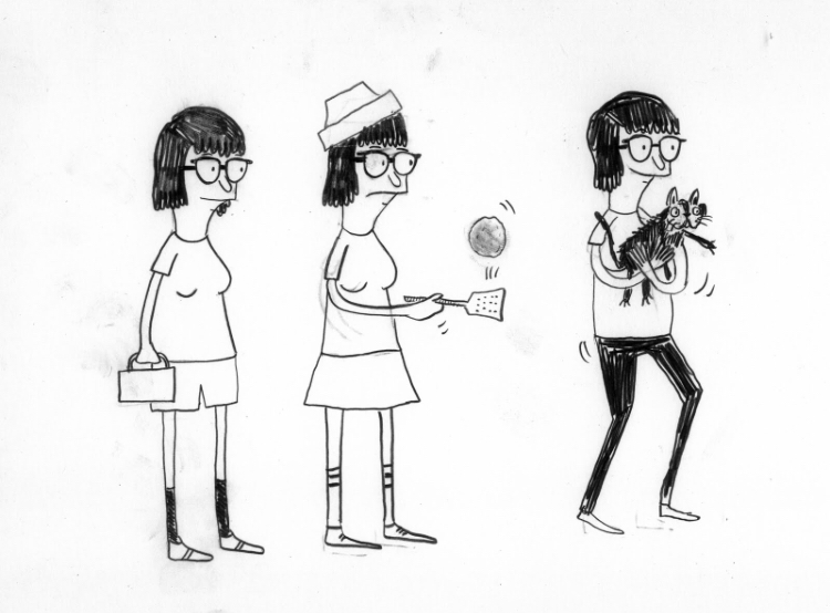
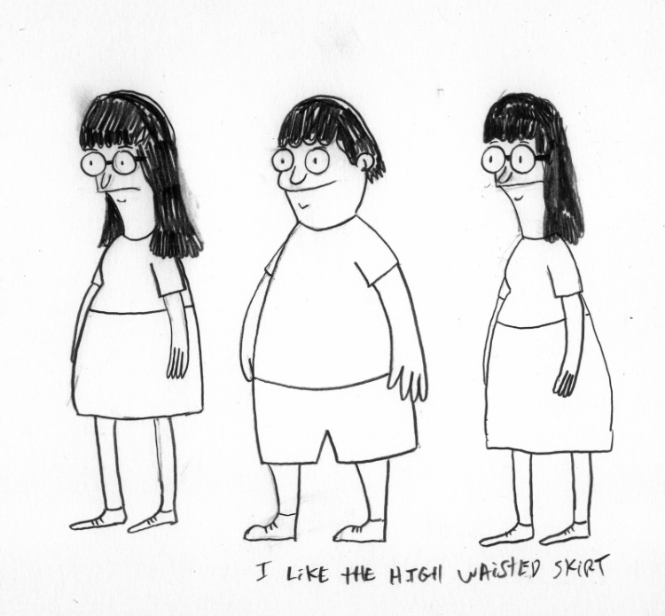
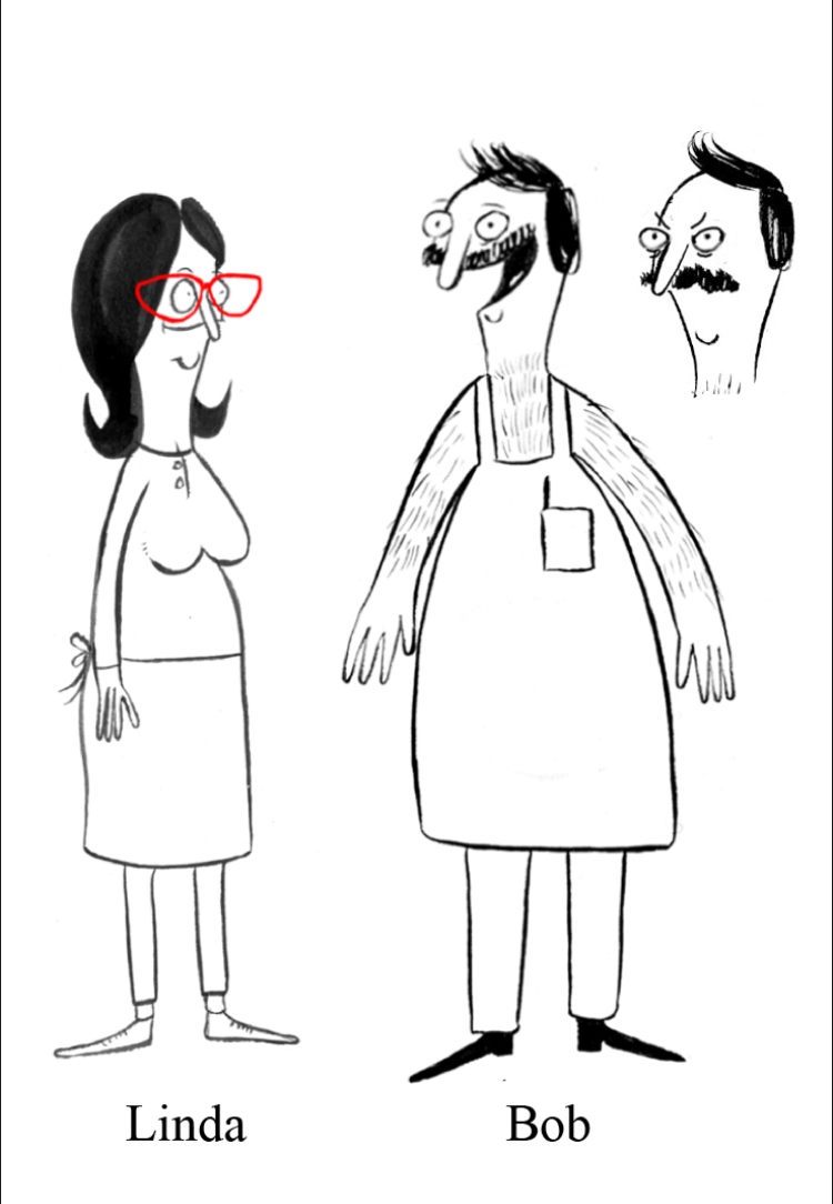
Anyhow, the original designs of the cast as drawn by Jay Howell look just weird.

Series creator Loren Bouchard admitted that they looked weird originally so it was a smart move to redesign the characters to the ones seen below.
Fun Fact: Did you know Tina Belcher was originally male and was named Daniel?
HEY!!! That's my name! Suffice to say, Dan Mintz does a better Tina than I ever would.


Remember these Six?
According to Paul and Joe, the Recess gang looked much different in their original pre-production designs. 


Spinelli was much younger, Vince had a rounder hair style, and TJ had a different design.
The only characters who remained the same were Mikey and Gretchen. 
Also, Gus wasn't around in the test pilot. I guess he was still in military academy.


What about my own art?
Well to be honest, When I settled on the final designs of the cast of Marylandia in 2016, it was clear my characters need improvement. 
They 2016 designs looked more pudgy and squashed.

 By 2017, my characters became more lankier and cleaner as seen below.

Why is this always happening to me. I thought I would complete these blogposts but I am missing photos because they're all in my external HDDs connected to my main computer but here I am typing these blogposts on my work computer which is a different machine compared to my home computer.

For those who are wondering, my work computer is an HP Z440 workstation while my custom built pc uses an MSI Micro-ATX motherboard. If you want to know more about the specs, here's a link to my website page:

Anyway, I need to get into the habit of using my home pc for blogposts instead of my work computer. It's more convenient this way since I have access to all my files.


Update as of August 3 2024:
On July 18 2024, Bob Newhart passed away.
R.I.P to Bernard the Mouse and Professor Proton from TBBT.

Ink Suit Acting-Is it effective or just stunt casting for facial construction?

I read this article on TV Tropes about this thing called INK SUIT ACTING.

What is that? It's where a character is made to look like the actor who portrays that character in particular.

Take for example Fiona from Shrek. The human Fiona has her face modelled to look a lot like her voice actress Cameron Diaz.

Why do they do this? Because Executives, that's why.

Executives think that they know who to choose, especially if it's a character they see on paper and they decide, "I WANT THAT PARTICULAR ACTOR TO PLAY THAT CHARACTER."

When that happens, it completely forgoes the audition process in favor of that particular executive or group of executives getting their intended actor just because they have all the veto power.

Sometimes, it's not the executives who choose the actors but rather somebody in production. That would explain why characters like GENIE were written for ROBIN WILLIAMS.


Some actors can at least tolerate this but others like Billy West criticize this as stunt casting. 

Really, I don't blame him.


And get this, sometimes, the ink suit acting is purely out of coincidence. 


How else would you expect to find the facial similarities between Castle in the Sky's Muska and his dub actor MARK HAMILL?


But yeah, In my opinion, the act of casting a character and copying his/her face needs to simmer down because I get where the criticisms are coming from. Raw talent is more important than capitalizing on an actor's image.


YEESH! Talk about embarrassing. I know this is just a short article I'm typing but I'm seriously lacking relevant photos. Guess this is what happens when I use my work computer to type my blogs instead of my Custom Built PC since that has my external hard drive containing my photos.


Wednesday, November 15, 2023

Translation from Pre-Viz to Final Output

Notice the single header part of this post's title?

I usually go for a two title approach but this time, I want to go in a different direction.

Now for the main attraction:

TRANSLATION FROM PRE-VIZ TO FINAL OUTPUT.


Have you ever stumbled on a Facebook post or blogpost made by someone where he/she says the pre-production artwork looks 10 times better than the final output? I've been there too.

The above is an example of a storyboard from an episode of Hilda and to me, the storyboard actually has more depth and liveliness to the poses when compared to the final version of that episode due to the puppet rigs used in the show.

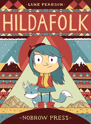
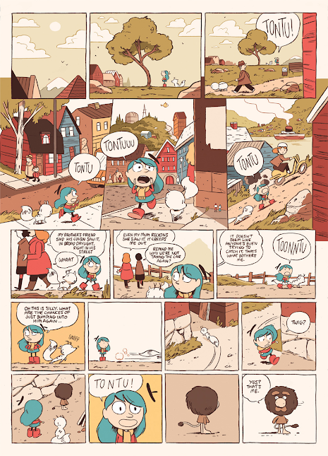
But believe it or not, Hilda didn't begin with that look originally. It actually began with a Comic series shown below.

Why didn't Silvergate Media and Mercury Filmworks use the original artwork for Hilda and instead went for the current style used in the actual series?

Just look at how beautiful these original drawings of Hilda looked as originally drawn by the hands of Luke Pearson. 

It's clear all Luke needed was pencil and sheets of paper to draw the comics although in reality, he drew the comics digitally using a Wacom Cintiq but you get the gist of it. 

Of course, as the comic progressed, the art eventually shifted.

Four years before the Netflix series, the art shifted to what it is now:

By the time the Netflix series was released...


Admittingly, I never actually watched Hilda on Netflix. When I first found out about this series back in 2018, I brushed it off due my instincts at the time telling me I not watch modern western cartoons due to Calarts style and puppet rigged mandates as well as hearing stories of executive vetoing ideas in favor of marketing and money.

I was surprised to hear that Hilda did very well which is unexpected but I was even more shocked when I discovered that this series actually started as a comic book back in 2010.

I guess we didn't get the comic here in Canada... or maybe we did but availability was very scarce.
I live in the Vancouver area and back in 2010, I didn't even know that there was a comic book called Hilda. Well know I know.

Maybe one of these days, I'll get a chance to watch it. Don't know if I'll make any blogposts about it but I will get the chance to watch the series one of these days.


Hold up, I'm not done with this blogpost yet.

I actually want to touch more on the topic on why I think pre-production and original graphic novel art is much better than the animated tv series art. And for an allegorical reason.

And it's all revolved around this:
HAGANAI: I DON'T HAVE MANY FRIENDS.

I've read many online posts and heard from many friends in high school and college how they often, for Japanese Franchises, prefer the manga over their anime adaptations.

I'm not going to lie. I sometimes feel that sentiment too. Sometimes, things in anime change so dramatically that they often don't resemble scenes that were originally in the manga.

I can give you an example from one scene from the manga that didn't translate very well to the anime.

There was that one scene where the protagonist's sister bites the arm of a another girl.
The original manga had more liveliness and more exaggeration to the scene but when the anime adapted that scene, it lacked energy from the manga.

I did have one photo taken from the manga but getting the images from the anime are more of a challenge due to the use of encryption on Streaming that disables screen captures and my oh my, iTunes and Netflix really are serious about their anti-screen capture sentiments.

Looks like it's going to be phone captures for me unless I find these episodes in MP4 format on the Internet Archive.

But wait there's more:

Just in time for the 50th Anniversary of Disney's Robin Hood, here are some photos of two characters from original cel to final film.
I like the top one better. More fitting for a Fox.

Why did they change Robin's design to the one below? 
Was the change mandated by Ron Miller or did Brian Bedford request the change?

Either way, I might as well bring out my Robin Hood Blu-Ray out of my movie shelf and insert the Blu-ray Disc in my PS5 when I get the chance. For a film released in 1973, I actually like it's colors and Xeroxed line-art slightly better than The Rescuers.

but then again that's like saying I like AN AMERICAN TAIL better than Land Before Time.

My arguments are moot by this point.


Anyhow, I've got another sneak peak:

I dub this "THE MANY WEIRD PLACES TO FIND INSPIRATION".
Sometimes things in real life inspires us. Whether it be a sign missing a letter and turns it into a hyper-conservative character, or a bathroom reflection that becomes a cosmic owl, there are many things in the world that can turn into a good idea whether it be story or a character design or name.

But that will have to wait until that particular blogpost, when I do get my research and photos.