Showing posts with label Pitches. Show all posts

Saturday, February 01, 2025

Omaha 02-First attempts, further practice, and other ramblings

Back in March 2024, I teased a hypothetical TV pitch for OMAHA the cat Dancer. 

I also stated that I would refuse to allow OMAHA be puppet-rigged.

I haven't done a lot of drawings of the characters for my pitch concept due to my job at the Café, PC upgrade, and changing rooms in my basement suit, etc.

It's really been eating up my schedule than it should be doing.


But nonetheless, nobody has touched the "OMAHA THE CAT DANCER" I.P yet so I guess I'll show off a few of my own concept drawings to show my enthusiasm.

Here's a drawing of Chuck Katt I've done.

Alongside some other drawings of these other characters.


It's been a TRIAL AND ERROR journey trying to do these designs right. In fact, here's one of the first drawings I've done of both Chuck and Omaha shown below and to say they don't look like the characters in the actual comic is sort of an understatement.

I tried real hard to make the characters avoid that Puppet-Rigged mandated crap but I ended up using my own art style.

Anyway, I wasn't happy with my first design attempt shown above because I have a fierce belief that redesigning existing characters just to fit into the TV cartoon atmosphere is a big no-no regardless of whether you refuse puppet rigs or forcing the characters into a CG world.

Not just for me but for other cartoon fans out there.

For Example: I've seen several posts and memes on Facebook about people heavily criticizing TEEN TITANS GO, Be Cool Scooby-Doo, the 2016 version of Ben 10, and the new NINJA TURTLES Nicktoon for redesigning characters just to cater to the newer generations.

Well screw that!!! But at the same time, I did not want the OMAHA characters to use my art style even if I want to keep the show STRICTLY HAND-DRAWN, frame-by-frame.....


So before my second attempt on drawing the characters, I saved a Bookmark of the OMAHA Comics from ARCHIVE.ORG as well as saved the Comics as PDFs that I stored on both my D Drive Samsung SSD as well as my 18TB WD easystore External Hard Drive so I can study the drawings, and try to work out a way to design the characters as close as possible to REED WALLER's designs.

Keep in mind that the original OMAHA comics are NSFW so I had to cherry pick my screenshots to be more age appropriate but still be considered TV-MA for my tastes.


And in case you're wondering, No I'm not using ADOBE ACROBAT to view the PDFs of the comics despite paying for the ALL-APP Creative Cloud plan.

ACROBAT's caused some conflicts with my PC's Crash Dump folder as well as my AVG ANTIVIRUS so I relegated my PDF Viewings to GOOGLE CHROME. 

It's not elegant but at least it's less of a hassle than Acrobat would ever be. 

If anybody knows of a better alternative to ACROBAT that doesn't balloon my CRASHDUMP Folder, let me know.

Otherwise, I'll have to concede....


Anyway, with that taken care of, here's another reason for me being interested in pitching an adaptation of OMAHA THE CAT DANCER:

A WAY TO SATIRIZE!!!!...... that's it.


Remember FRITZ THE CAT from 1972?


Well, that was Ralph Bakshi's way to satirize life in the 60s. 

It was also his way to vent his extreme frustration with the way ANIMATION in AMERICA was refusing to grow up with the older crowd:

The year was 1968, the HAYS CODE was completely dissolved


and in it's place is the MPAA Rating system. 


This allowed stuff such as Extreme, Brutal, Mutilating violence as well as strong coarse language and all the sex and nudity as well as the narcotic abuse that was all forbidden by the HAYS OFFICE...


But it was only LIVE-ACTION films that were allowed that kind of treatment.


According to executives, religious fundamentalists, and parents:

CARTOONS WERE FORBIDDEN TO TOUCH THE X-RATED STUFF!!!

This fundamentalism scared the bejesus out of certain executives to the point where the execs take existing I.P such as Popeye and Tom & Jerry and rewrite them from the slapstick characters we know and love and turn them into puppets for saccharine pieces of shit on TV.

But there was nothing that artists or writers could do about that.


RALPH BAKSHI didn't want to work in that environment but at the same time, he was passionate about the animation business so he went against all odds to allow FRITZ THE CAT to be made as the X-Rated gem it is to this day.

To quote Ralph Bakshi in 1971:

"The idea of grown men in cardigan sweaters drawing butterflies floating over a field of flowers while American planes are dropping bombs in Vietnam and children are marching across the streets is LUDICROUS!!!."


Yeah I know how you feel Ralph.... I'd go MAD if I experienced that first hand and the only cartoons I could see being churned out is FAT ALBERT, 70s TOM & JERRY, or other 70s cartoons who's potential was shat on by both executives and moral guardians.

And for one, I'm starting to see that in my own eyes as of 2025 but in a different perspective.


Anyway, back to OMAHA..... the comics that is.

I noticed that some of the drawings are rather crude.... as in they can often go frequently Off-Model when compared to how the characters look from the Front covers to the promotional artwork.

Yes I know the term OFF-MODEL is a major berserk button for some animation fans but I do applaud Off-Model because it allows for more fluidity for the character construction as well as to allow the characters to emote with Extreme depth....

I bet you the art being this off-model at points really does give us some deja-vu on how most comics actually start out in the very beginning artistic wise.


For example, in the First Asterix Comic: ASTERIX THE GAUL, the characters had a more angular and rougher appearance to their anatomy.


But after several albums later, the final designs were fleshed out.

So using the examples of the OMAHA scans I've got on INTERNET ARCHIVE, I studied the drawings and facial features of characters. By sticking to Waller's Cover designs of the characters where they look much less loose, sort of dissimilar to their designs on the Front Cover of the comics.


The Problem with this first example I drew was that I drew both Omaha and Chuck using the dog nose design philosophy mixed with my art style was pushed into these characters which is weird because the two are cats.

For those who are curious what DOG NOSE is, it's a philosophy on cartoon animal design where to make a supposed animal character look less human but still keep his/her anatomy without heavily redesigning them, just add a black or dark grey horizontal ellipse or upside down triangle and call it a day.

I did a post about it back in Mid-May 2024 so if you want an in depth know-all about what the heck DOG NOSE is about, here's the link to that post:

https://maverickmartinezarchive.blogspot.com/2024/05/dognose-three-designs-for.html


One example shown below are ANGEL AND OMAR from Nelvana's ROCK AND RULE from 1983.


A more famous example are the characters from Mickey Mouse.... or property focusing on GOOFY and his son MAX GOOF.
SUCH AS 1995's A GOOFY MOVIE.

Fine for characters created specifically for that respective universe but I bet once OMAHA gets picked up as a tv show or AMAZON ORIGINAL, the executives are going to push for celebrity appearances. I'm not sure if I want to go that route. I mean, would I really want to have a celebrity with dog nose applied to their facial design?

Just take a look at MOK shown below. His design screams MICK JAGGER but his facial design is hampered by the dog nose design. It's just looks so weird because it's just MICK JAGGER. Even though Mick did not provide MOK's voice. That was done by Don Francks.

"Rip that dog nose mask off of your face MOK! "

It's going to be a hassle for me to process that but then again, you can draw whatever the hell you want in animation so who knows, I might design a Feline Version of Keanu Reeves or a Canine Husky Version of Jason Langvin from JAYZTWOCENTS.

Of course, for every celebrity caricature, you need to retain the facial features of each celebrity.


Back to OMAHA, I studied very carefully how to draw the characters. 

I admit, Not perfect but close enough to Reed Waller's art style.

But I also decided to add my own touches without resorting to my own art style.


For example, in the original comics, The anthropomorphic animals are drawn with four fingers.


I've read that it's due to the fact that mammals have 4 toe balls on each paw.

Really a dog's paw in the image example but you get the gist of it.


Four Fingered hands are actually my berserk button because it's seen as lazy in terms of hand and finger design.


Plus, four fingers is considered a sin in Japanese design. Did you know that Four Fingers is outlawed in Japanese animation because it draws unfortunate implications to things like:

labor accidents, 

the number four being a translation of death,


And last but not least, THE YAKUZA.


So considering I plan to outsource OMAHA's animation to a Japanese animation house such as either SCIENCE SARU or MAPPA so I can avoid Puppet-Rig mandates, I also need to respect the Japanese by avoiding any mentions of the Burakumin Meat packing subclass as well as not be in cahoots with the Yakuza or the Shinigami, so Five Fingers on each hand is a must.

If Jim Jenkin's DOUG (Both Nickelodeon and Disney) can give all 5 fingers on each hand for their characters....


Then I can give all Five Fingers on each hand for the characters in OMAHA.


But how do you do 5 fingers on Animal Paws?

Easy, COUNT THE NUMBER OF CLAWS ON EACH PAW.

I know this by experience from clipping Miso the Feline's claws.

You can't expect me to hold Miso and take a photo with my iPhone so instead, 
I'm showing this medical drawing of a cat's paw.


Of course, the Cat population in OMAHA THE CAT DANCER never use their claws for self defense so the claws don't show up even if Chuck gets into a fist fight with Jack the cat.

I will not write any plots involving DECLAWING the paws of the characters.... just don't make me.


Also, You'll notice on animals that they have Pads on their paws

         "Can I haz photo of my footpads please?"


but in the world of OMAHA, none of the characters have footpads on their hands or feet due to their humanized anatomy.

So footpads are out of the question.


Also in the first attempted drawing above, I tried to have the cat characters have a sense of realism in terms of the feet.


As seen below, this is how a Cat's leg looks according to skeletal studies and body mechanics.


The feet on the characters of OMAHA THE CAT DANCER however are drawn as if Mr. Waller had  surgically grafted some human feet on to animals.

I was seriously debating to myself if I should keep true to the comics in terms of feet,

or stick to my guns and draw anatomically correct cat feet. 

The cat feet thing is actually a rule I refer to on my HOW TO DRAW MANGA book.


In the end, I went back to human shaped feet just as Reed Waller intended.

You may notice on some of these Expression Sheets of both OMAHA, CHUCK, etc., that I also integrated fangs on their teeth because let's face it, you can't have anthropomorphic animals without their proper set of chompers would you?

Even characters in DISNEY'S ROBIN HOOD wouldn't be caught dead without their fangs and ROBIN HOOD here insinuates the importance of his fangs.


And to seal the deal about keeping the fangs even with when Characters are smiling, here's a scanned drawing of Shelly Hines smiling while also showing off her cute fangs:


You'll also notice the black outline on the lips of many an animal in real life.

Aside from THE LION KING,


and BOOBOO RUNS WILD,
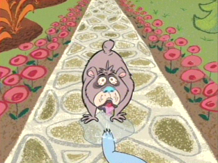
many artists who draw animals, especially those who draw FURRIES avoid the black lip outline since it makes the animals look feral.


I guess the characters of OMAHA THE CAT DANCER will also avoid the lip outline as to avoid any portrayals of feral instincts.


But I want to realistically portraying the cat fangs as realistic as possible by keeping them inside the mouth so I guess no Chuck Jones' Patented Skin Tooth for Omaha, Chuck, Shelly, etc.

"Nobody steals Chuck Jones' patented skin tooth. Nobody."


While for animals, it's essential to retain the tail, I'm not sure if I want to retain the tail as seen in earlier concept artwork I've done. Especially if overlapping action and follow through is a must.

Reed Waller managed to keep the tails on his cat characters such as with Chuck Katt shown below....

But can you imagine having to animate tails?

It's one thing to have the tail animated in animation but it's a bugger, especially with all those deadlines involved so I guess that tail may need to be culled from the drawing board...

We'll see.


We all love to dress up our cats in costumes so they look cute,
Regardless of whether they yowl or not.


But in OMAHA, the characters have human anatomy so they cannot exposure their breasts or dicks in public without pissing off the cops or religious groups, so they all have to wear clothes.


Even some cartoon bipedal animals out there wear partial clothes too, just that it differs from cartoon to cartoon.


Not with OMAHA. 
Like I said, Human Anatomy for the characters. 
So that means full on clothing.

I'll debate once the series gets picked up whether or not we should establish a signature wardrobe or alternate clothing options like we do in real-life.


Anyway, that's how I attempted to draw the Omaha characters but I wanted to stay true as close as possible to Reed Waller's designs.

Yes, I know executives will ask for these characters to be redesigned so that it's...ANIMATABLE... so I did my best to convert the designs but avoid the CalArts style of redesign while also sticking as close as possible to Reed Waller's Designs.

AND ALSO NEGOTIATE TO HAVE THE SERIES HAND-DRAWN, FRAME BY FRAME!!!


Also, I will not accept generative AI art in terms of concept or animation of OMAHA. 
I will only deal with REAL HUMAN ARTISTS with actual skill but If OMAHA does get picked up as an actual animated series, I will be committed to start my own classes to teach new artists how to draw the characters using old fashioned methods. As well as my knowledge of Body Mechanics too.

That also explains why my OMAHA drawings are done on paper instead of the computer or my NINTENDO 3DS.... to an extent.

Next OMAHA Pitch Post will have some digital drawings done on PHOTOSHOP but at least still drawn by hand on my WACOM Tablet.

Regardless, Physical art is the best way to build your portfolio but so is getting educated.

Yes, I'm committed to teach as I have taught some drawing classes before.
If the Disney artists were able to hold their own classes at the old Hyperion building in the 1930s, then I can hold my own classes in my own studio in the 2020s.

And one thing, I'm hesitant pitch this series concept to Warner Bros because of DAVID ZASLAV. 
I don’t feel safe pitching to a network run by a jackass who has no faith in animation and would claim unfinished projects as a tax-loss.

My preferences are either Netflix, Amazon, SkyDance, or whatever network is being run by people who have good faith in animation. 

I originally began this post using my Maverick Warhawk AM4 build but since I took way too long to finish this post, I've since upgraded to my new Maverick Falcon AM5 Build.

Also, when I made this post, it was made via a combination of my Custom Builds with their respective Razer Keyboards as well as my Laptop's SteelSeries Scissor Switch Keyboard.

And I've now finished this post using my newly purchased on Cyber Monday EPOMAKER DYNATAB75 Gasket-Mounted Tactile Keyboard.

Like I teased earlier, there will be a part 3 to the OMAHA TV Series Pitches.
Next post will focus on further drawings, anatomy studies, and voice audition guidelines.
But that may not be until Spring Break 2025 so please be patient.

As always, see you next post.

Tuesday, November 26, 2024

Before the GENTLEMAN THIEF graced television screens-THE LUPIN III 1969 PILOT FILM

When Lupin III premiered on August 10 1967 as a manga series written and illustrated by the late KAZUHIKO KATO, aka MONKEY PUNCH, 


Little did people or Kato himself, know that what was spearheaded that day would forever change the landscape of Anime Audience Perception.


But did you know that before the 1971 series debut, TMS made a pilot film in order to appease bankers and financers to gain some finances to produce a series before the project goes PRIMETIME?

It's true. 

Behold the PILOT FILM of LUPIN III

What differs with this version of LUPIN vs. the later more well known adaptations is the visual presentation.


Unlike the later anime adaptations which often at times prefers to deviate away from MONKEY PUNCH's art style, in favor of something more CONVENTIONAL for the presentation, 

This PILOT FILM seeks to make the art sort of match MONKEY PUNCH's art in ways you can't possibly imagine.


That's the fierce dedication that the artists have when they happen to be fans of the author.

Also, some of the voices sound different too.


Most noticeably ARSENE LUPIN III himself.

Before they decided to have YASUO YAMADA perform the voice of the gentleman thief, they had given ARSENE's grandson a different tone of voice in both performance and octave.

That may explain why LUPIN sounds deep-voiced instead of NASAL and funny which we've come to associate the thief with.


In the Cinemascope version, he was portrayed by NACHI NOZAWA

while on TV, he was portrayed by Taichiro Hirokawa.

None of these actors accurately portrayed the Nasal octave and performance tone that YASUO YAMADA was known for.


Also, Zenigata and Goemon have their respective actors swapped.... sort of.


In Cinemascope, Zenigata was performed by SHINSUKE CHIKAISKI,

While on TV, it was CHIKAO OTSUKA.


In Cinemascope, Goemon was portrayed by GORO NAYA,

while on TV, it was OSAMU KOBAYASHI.


When the TV series premiered, OTSUKA and NAYA swapped their parts as NAYA felt he's better off as Zenigata while OTSUKA felt he's a better GOEMON.


Of course, in part 2, OTSUKA was replaced with MAKIO INOUE.


The only noticeable standouts who would actually be mainstays in LUPIN till their retirement later in life were

KIYOSHI KOBAYASHI as JIGEN

and EIKO MASUYAMA as FUJIKO.


Did I say that the animation of this PILOT FILM aimed to mimic the art style of MONKEY PUNCH?

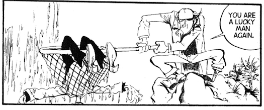
Here are some images of the manga to prove what I'm talking about:


Now let's use some VLC Screenshots to compare to the MANGA:


You'll also notice this old man on the right next to Zenigata.


Apparently, TMS was planning to add this character to serve as a fatherly assistant to the inspector.

He goes by the name of KOGORO AKECHI.
This character already existed before LUPIN so I think the plan was to bring this character full circle as an adversary for Lupin considering he actually arrested the thief in the the very first Chapter of the Manga.

But my guess was there was a Copyright issue with this character back in the late 60s that prevented this character from appearing in future LUPIN III adaptations so TMS dropped AKECHI from the LUPIN Canon.

Where can you find the pilot film?

If you have the Green Jacket DVDs, then it's where you can find this.

I'm sure it's also on YOUTUBE but...


You might be asking

"HEY DAN, WHERE THE HELL ARE THE SUBTITLES? IS THIS THING DUBBED?"


My answer:

The pilot film was never officially dubbed in ENGLISH. 

The version of the Pilot film I'm using for my VLC Screenshots is actually in Japanese but for some reason, the copy I found on ARCHIVE.ORG is the Raw Japanese print so that's why there are no subtitles.


Also, the print I'm using is the TV Pitch print from the 1971.

I'm still on the lookout for the original Cinemascope Print with the original 2.35:1 Aspect Ratio as well as the original actors but finding the Lupin Pilot Film in Cinemascope has been surprisingly difficult.


And no, Lupin himself didn't steal the Cinemascope Prints.

He fiercely believes in film preservation as much as we all do.


Anyway, after these prints of the PILOT FILM were made, they all spearheaded the LUPIN Franchise.


The first was the Green Jacket TV Series in 1971


The Red Jacket Series from 1977 until 1980

The Pink Jacket series from the Mid-1980s


Theatrical Movies that include


Mystery of Mamo in 1978


Most famously CASTLE OF CAGLIOSTRO in 1979


The various Tv Specials which can range from Artist to Artist depending on the special

And culminating in the 3DCG theatrical movie released in late 2019


While the art for Lupin has changed over the years depending on Animation Director, production team, budget, or whether the team prefers to mimic Monkey Punch's art vs the Fandom preferring the art to be as conventional as anime should be, 


Be sure to remember where it all started.


Sure, the Manga started in 1967 


but the animation of Lupin all began with a simple Pilot Film released in 1969 and was originally meant to be screened to investors....

Which succeeded the second time around during the start of the 70s.