Notice the single header part of this post's title?
I usually go for a two title approach but this time, I want to go in a different direction.
Now for the main attraction:
TRANSLATION FROM PRE-VIZ TO FINAL OUTPUT.
Have you ever stumbled on a Facebook post or blogpost made by someone where he/she says the pre-production artwork looks 10 times better than the final output? I've been there too.
The above is an example of a storyboard from an episode of Hilda and to me, the storyboard actually has more depth and liveliness to the poses when compared to the final version of that episode due to the puppet rigs used in the show.
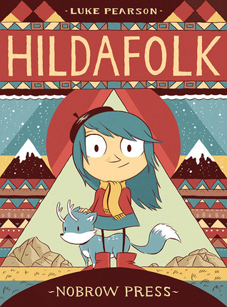
But believe it or not, Hilda didn't begin with that look originally. It actually began with a Comic series shown below.
Why didn't Silvergate Media and Mercury Filmworks use the original artwork for Hilda and instead went for the current style used in the actual series?
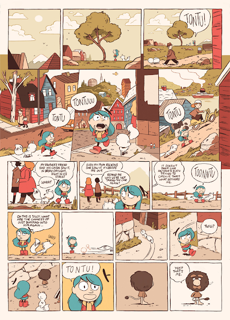
Of course, as the comic progressed, the art eventually shifted.
Four years before the Netflix series, the art shifted to what it is now:
Admittingly, I never actually watched Hilda on Netflix. When I first found out about this series back in 2018, I brushed it off due my instincts at the time telling me I not watch modern western cartoons due to Calarts style and puppet rigged mandates as well as hearing stories of executive vetoing ideas in favor of marketing and money.
I was surprised to hear that Hilda did very well which is unexpected but I was even more shocked when I discovered that this series actually started as a comic book back in 2010.
I guess we didn't get the comic here in Canada... or maybe we did but availability was very scarce.
I live in the Vancouver area and back in 2010, I didn't even know that there was a comic book called Hilda. Well know I know.
Maybe one of these days, I'll get a chance to watch it. Don't know if I'll make any blogposts about it but I will get the chance to watch the series one of these days.
Hold up, I'm not done with this blogpost yet.
I actually want to touch more on the topic on why I think pre-production and original graphic novel art is much better than the animated tv series art. And for an allegorical reason.
And it's all revolved around this:
I've read many online posts and heard from many friends in high school and college how they often, for Japanese Franchises, prefer the manga over their anime adaptations.
I'm not going to lie. I sometimes feel that sentiment too. Sometimes, things in anime change so dramatically that they often don't resemble scenes that were originally in the manga.
I can give you an example from one scene from the manga that didn't translate very well to the anime.
There was that one scene where the protagonist's sister bites the arm of a another girl.
The original manga had more liveliness and more exaggeration to the scene but when the anime adapted that scene, it lacked energy from the manga.
I did have one photo taken from the manga but getting the images from the anime are more of a challenge due to the use of encryption on Streaming that disables screen captures and my oh my, iTunes and Netflix really are serious about their anti-screen capture sentiments.
Looks like it's going to be phone captures for me unless I find these episodes in MP4 format on the Internet Archive.
But wait there's more:
Just in time for the 50th Anniversary of Disney's Robin Hood, here are some photos of two characters from original cel to final film.
I like the top one better. More fitting for a Fox.
Why did they change Robin's design to the one below?
Was the change mandated by Ron Miller or did Brian Bedford request the change?
Either way, I might as well bring out my Robin Hood Blu-Ray out of my movie shelf and insert the Blu-ray Disc in my PS5 when I get the chance. For a film released in 1973, I actually like it's colors and Xeroxed line-art slightly better than The Rescuers.
but then again that's like saying I like AN AMERICAN TAIL better than Land Before Time.
My arguments are moot by this point.
Anyhow, I've got another sneak peak:
Sometimes things in real life inspires us. Whether it be a sign missing a letter and turns it into a hyper-conservative character, or a bathroom reflection that becomes a cosmic owl, there are many things in the world that can turn into a good idea whether it be story or a character design or name.
But that will have to wait until that particular blogpost, when I do get my research and photos.


No comments:
Post a Comment