I'm often fascinated by all the concept art I see of characters from before their final design but I also delight in people saying that pre-production art looks 10 times better than what they actually look like in the final product.
Believe me, I've seen them, and I save the images or take photos using my iPhone and now I'm going to show you what I truly see in Pre-Production character art before the final designs are approved.
Look at how Bernard looks in this photo. He looks much thinner and more insecure than he is in the final product.
Looks like something that Woody Allen would have portrayed but instead, Allen would portray an ant in 1998.... And the role of Bernard would ultimately go to Bob Newhart.
I really like this pre-production art of Miss Bianca. Would have been better if they kept this artwork instead of portraying a half-naked mouse with nothing but a scarf and hat.
But what I really like about this design is how it predicts the rise of Anime Influence in alot of modern American artists. This looks like Fanart to me but who knows, maybe this is actual production art.
Of course, even if this design was approved, Eva Gabor would still fit for this design. If only Rescuers used Dolby Technology for sound instead of RCA PHOTOPHONE.
Early Sheridan College Era 1978 Stimpy according to John K.
He has stated that when he drew Stimpy, the titular Manx cat was drawn to be way more retarded than the Stimpy we now know and love.
But, yeah, just like with Doug being forced by Nickelodeon to have eyebrows, the upper brass at the Slime Factory demanded Stimpy have normal eyes and a slightly higher intelligence though they did allow the mouth to remain the same.
Not all the time though.
Fun Fact: Did you know that Stimpy's design was inspired by the two cats from the 1945 cartoon "Gruesome Twosome"?
Alvin and the Chipmunks, as well as dad Dave Seville look way better in their original 1961 THE ALVIN SHOW designs. I don't get why when people talk about Alvin, they only care about the 80's incarnation.
No, Dave Seville is not puppet rigged, this is actually how he looked back in 1961 but I will say, if Ross Bagdasarian wants to revive Alvin with 2D Animation and puppet rigs, just stick to the 1961 designs since their easy enough to reference for puppet construction.
I like Darth Vader the way he is designed but stop and look at Ralph Macquarie's design of the dark lord below. Look how more menacing his helmet was.
To a point that Star Wars Rebels would actually reference the helmet when they designed Darth Vader's 3d model.
To a point that Star Wars Rebels would actually reference the helmet when they designed Darth Vader's 3d model.
Kazuhiko Katō(AKA MONKEY PUNCH)'s original Chaotic Evil Arsene Lupin III.
Totally would prefer this design of Lupin over the more toned down versions seen in the various anime and publicity material I've seen of this thief.
Ok Ok. So maybe I'm glorifying in character art that look better than the final product but sometimes, there are character art that actually benefit from being designed over and over again.
DOUG is one example.
When Billy West was casted, Doug had to gain eyebrows so he can actually emote. There were several Season 1 episodes that forget to add eyebrows on Doug and he just looked odd without them. Thank balls he has eyebrows.
You'll also notice that compared to his later Disney incarnation, Doug's scalp is also much rounder and vertically symmetrical....Though there is that one Season 1 episode from the Nickelodeon era where flat scalped Doug did slip up from time to time.
Another character that really benefitted from final design is the cast of BOB'S BURGERS.
Yeah Yeah, I know, BOB'S BURGERS is a modern show but unlike most modern shows, I actually like the concept of a struggling family making ends meet with good food and good friends.
Totally loving that Side Profile Closeup of Patti Mayonnaise.
So why flatten the scalp? Well my guess is that to age up the character but not change anything majorly about Doug was to flatten the scalp and make him slightly more lankier. They also simplified his sweater vest and wear longer sleaves. He stole wore shorts though so it's only during the winter season Doug wore pants. Despite changing color, his shoes may still be the same from the Nick Series.
This however came at a cost: Billy West had a salary dispute when Disney's executives refused to increase his pay and that pissed off West so much that he quit voicing the character so now he has a different voice in that version Courtesy of Thomas Lyons but that made him sound much more whinier compared to the voice West used prior.
Don't worry. Doug's original vocal chords live on in FUTURAMA'S Philip J. Fry.
Speaking about Salary Disputes, Why didn't West fully back John DiMaggio during the Hulu salary dispute of February 2022? I'm guessing West is still sore about losing Doug to F***ing Thomas Lyons that he wanted no part in arguing with executives but I'm guessing he still supported DiMaggio's dilemma.
Anyway back to topic.
Another character that really benefitted from final design is the cast of BOB'S BURGERS.
Yeah Yeah, I know, BOB'S BURGERS is a modern show but unlike most modern shows, I actually like the concept of a struggling family making ends meet with good food and good friends.
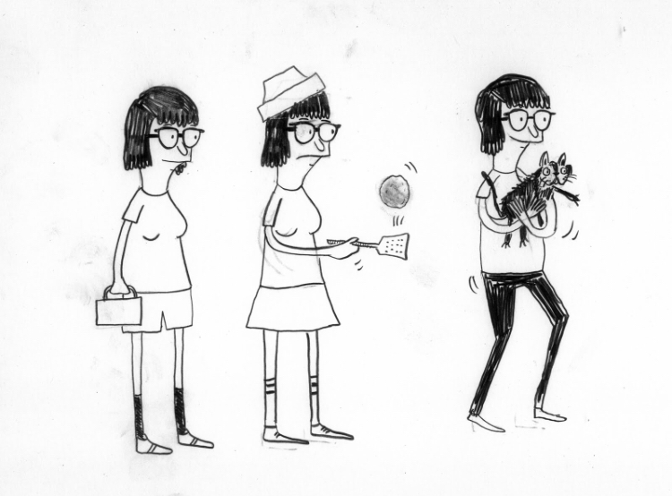
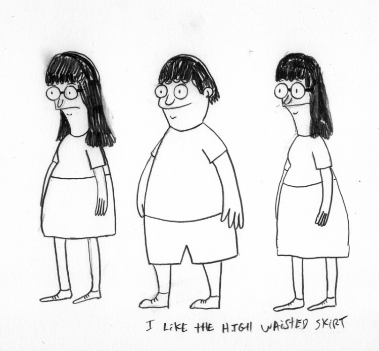
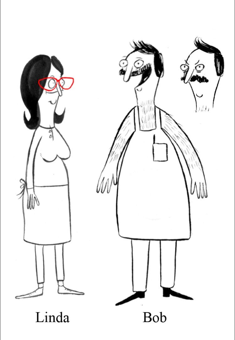
Anyhow, the original designs of the cast as drawn by Jay Howell look just weird.
Series creator Loren Bouchard admitted that they looked weird originally so it was a smart move to redesign the characters to the ones seen below.
HEY!!! That's my name! Suffice to say, Dan Mintz does a better Tina than I ever would.
Remember these Six?
According to Paul and Joe, the Recess gang looked much different in their original pre-production designs.
Spinelli was much younger, Vince had a rounder hair style, and TJ had a different design.
The only characters who remained the same were Mikey and Gretchen.
The only characters who remained the same were Mikey and Gretchen.
Also, Gus wasn't around in the test pilot. I guess he was still in military academy.
What about my own art?
Well to be honest, When I settled on the final designs of the cast of Marylandia in 2016, it was clear my characters need improvement.
They 2016 designs looked more pudgy and squashed.
Why is this always happening to me. I thought I would complete these blogposts but I am missing photos because they're all in my external HDDs connected to my main computer but here I am typing these blogposts on my work computer which is a different machine compared to my home computer.For those who are wondering, my work computer is an HP Z440 workstation while my custom built pc uses an MSI Micro-ATX motherboard. If you want to know more about the specs, here's a link to my website page:
Anyway, I need to get into the habit of using my home pc for blogposts instead of my work computer. It's more convenient this way since I have access to all my files.
Update as of August 3 2024:
On July 18 2024, Bob Newhart passed away.
R.I.P to Bernard the Mouse and Professor Proton from TBBT.


No comments:
Post a Comment