Showing posts with label Too many losing Heroines. Show all posts

Thursday, March 06, 2025

The Problem with Symmetry & why you should champion asymmetry both in the facial expression and the posing.

One thing to really get a sense in designing characters is to make sure that you understand that NOT EVERYTHING IN LIFE IS ABOUT SYMMETTRY!!!

Seriously!

Look at yourself in the mirror, does everything in your face scream SYMMETRY!?

NO IT DOESN'T!!!


The focus on Asymmetry is key to making your characters look lively.

Symmetry is not king, all it does is make your characters look wooden or in this case, dead.


Frank Thomas, Late Animator and member of Disney's Nine old Men, warned us about the dangers of symmetry in the 1981 book DISNEY ANIMATION: THE ILLUSION OF LIFE

Though the example above has more to do with poses instead of facial construction.

But the principle is still the same: AVOID SYMMETRY!!!

I first learnt about the dangers of Facial Symmetry by taking a photo comparing the facial similarities of both Nadia and Shinji.


I don't have the photo with Shinji at the moment but the photo of Nadia from above does illustrate how unnatural symmetry really is. Just pay attention to her hair.


Compare that to this scene of Nadia below


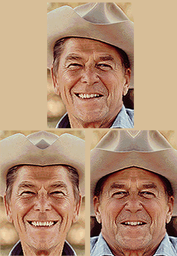
So until I find the Nadia/Shinji photo, I'll have to use this example of RONALD REAGAN

Anyway, Take a look at this drawing of Mickey Mouse as drawn by Freddie Moore.


Nothing in this pose is symmetrical. It's all differing facial muscle poses between the left and right side of the face.


That's one thing to take important note of.

One thing to really grasp in terms of really understanding how unnatural symmetry is to understand how your facial muscles hold your face together.

Many artists, regardless if it's 2D, CGI, Puppet Rigs, etc.

Do know about how the facial muscle structure works but often neglect to understand how important it is to understand that your facial muscles cannot grant PERFECT SYMMETRY.


This is a major issue and pretty much why I still get a bit peeved whenever I see drawings from fan artists but it's always symmetry this or symmetry that in terms of the face.


We've all been in art classes in the past so we should know this by now.


And I also been through that trial before with my characters.

I've also learned that even if I'm forced to draw my characters with at least a hint of symmetry, it's not guaranteed to be perfect.

But that's ok.

That's because I got natural talent. I don't need to use a measurement chart just to draw a character. I just rely on my natural instincts when I'm drawing characters on a canvas.

Such as this drawing of a Befuddled Hayden Brentwood shown below

(On the left side of the canvas)

Yes, his nose and light source highlights look symmetrical but this was drawn with pure raw talent, without the need for any measurements of the face or the body.

And believe me, Even though Western Cartoons are just as guilty of using symmetry for their characters, (I'm looking at you SIMPSONS, & FAMILY GUY)

There are still holdout examples that subvert that symmetry rule.

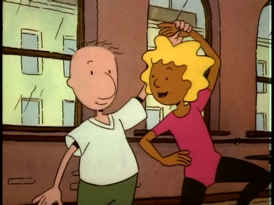
Take for example, DOUG FUNNIE as shown below.

Throughout the almost 9 year run of DOUG(Both Nickelodeon & Disney), There aren't many times that DOUG faces the camera with his front profile but despite his simplistic face, he never shows any signs of symmetry.

"You wanna know why?
Because of my big NOSE. That's why."


Yes, DOUG..... I mean..... Quailman.

Because of Doug's big nose, he never has any sense of perfect symmetry in the face.

But you also forgot that fact that most of the time, it's also due to the artists' being mandated by Jim Jinkins to remove one eyebrow off of DOUG and friends' face.


Even when the Mouse House took over the DOUG I.P in 1996, they still respected Jim's NO SYMMETRICAL EYEBROW mantra.
"Regardless of Network change, the Single Eyebrow Mantra remains the same!"


Alright, cut it out Quailman!!! I'm doing the typing here.


And symmetry is not limited only to the face but also to posing.

This is referring to twinning and it's generally discouraged in Animation posing.

Again, let's refer to this drawing from Frank Thomas about the dangers of symmetry with posing.
As Thomas said, if the poses are the same in the body, sans the position of the head, then the pose is considered dead as demonstrated by the cardboard cutout of Mickey in Figure Page 2.
Page 3 is more lively where Mickey's hands are in different positions and his front torso on his 
COG is bent a little forward. 
Also, his symmetrical expression is designed with a more natural slanted oval shape.


I've seen some scenes from Anime during the 2010s where the animators and some fan artists were so obsessed with symmetry and twinning that it I didn't realize it in the first place but now it's starting to bug me.

It's still a problem today but at least it's now under more control both production and fanart. 

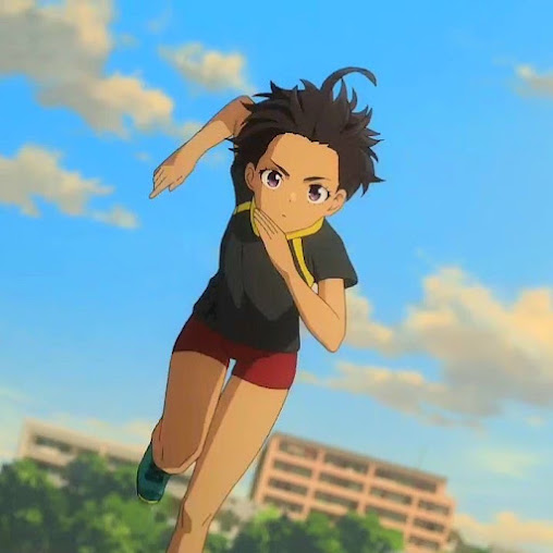
Take this example of Chika Komari from MAKEINE 
Her blushing here looks like a symmetrically twinned pose but it's actually asymmetrical.
Pay attention to her hair, the position of her knuckles, her eyebrows, and the fact she's holding her iPhone SE (3rd Gen) in her hand.

Again, Komari-Chan from MAKEINE.
Pose is still asymmetrical. 
And it's not limited only to her design or pose but also her head position.
Also the light source.

I'm using anime examples since it's all still Hand-Drawn because If were to use modern Western Animated examples, my comparisons and blowback would have been egregious.

But some would say, Why criticize Symmetry when it's also used in CGI.

During the modeling phase, Symmetry is used no matter what so you can get the face just right.

but I cut CGI some Slack because the symmetry can be deprecated once the rigging comes along....

Then you can afford all that asymmetrical posing and expressions you can ask for.

I was planning to do this blogpost talking about symmetry and avoiding twinning in the poses since the January 2023 migration from Wix Blog to Blogger.com,

But things in my life just happen and I've since lost a lot of control, what with industry frustrations alike.

Now 2 years later, I finally got around to doing said post.

In terms of digital drawings, I don't use measuring tools when I draw my characters. 
I always rely on hand-eye coordination and raw natural talent.

That and I always start my digital drawings on paper first before I scan the drawings into my PC using my Canon Pixma Printer's built-in Scanner and then take it into photoshop.

And yes, I even draw my characters on Photoshop before I take them into the Modeling phase so I can get a sense of how to model my character in MAYA.


Anyway, be sure to be on a lookout for future posts about Animation, Modeling, acting,

And yes, even DOUG.

As always, see you next blogpost.

Tuesday, February 18, 2025

Clash of the Dark Skinned Athletic Girls-Patti Mayonnaise vs. Lemon Yakishio

I was capturing some DOUG episodes on my 

Avermedia Live Gamer Portable 2Plus using RECentral on the Maverick Falcon 7900RT AM5 PC as the capturing computer and using my MSI Laptop as the host machine and the CHROME Browser to bypass that stupid HDCP crap.

and while I was checking the MP4 File that I've captured to make sure the image is in perfect high quality 4K/60fps without artifacts or chromatic aberration, I had an epiphany.


Let's compare two athletic dark-skinned female characters and see what makes the two different from each other.


That being PATTI MAYONNAISE from DOUG

I'm using the original 1993 Patti from the Nick era because Fandom,
 and I personally like long haired Patti better.


and 


LEMON YAKISHIO from MAKEINE: TOO MANY LOSING HEROINES

Yeah, having to compare a former Nicktoon girl with a Japanese girl with Tan skin from a more recent Manga/Anime series is pretty intriguing.


Anyway, what's similar to the two is that Patti and Lemon both are dark skinned.


But Patti's skin is due to an acrylic cel paint choice made by Jim Jinkins to allow the character to blend well with the rest of the characters who have literal colors for skin tone.


Lemon on the other hand, she's dark skinned but she has a visible tan, especially in scenes where she's at the beach, bathtub, or a locked storage shed fighting dehydration.

Also, She's Japanese.

And TOO MANY LOSING HEROINES takes place in Toyohashi, Aichi, which is relatively south of Japan.

But my guess is that during one of Lemon's vacations turned opportunities to perfect her exercises and figure, she decided to sunbath with her track suit.

As you can see in the image above, Lemon has tan lines.

I know everyone knows what Lemon looks like with her Tracksuit on but for those who are curious:


Like I said, the two characters are known for being athletic.


Regardless if she's wearing pants or a skirt, Patti is athletic through and through.


One difference between Patti and Lemon are their choices for Boyfriends.


Throughout the 9 years of the show being on the air via two networks, 

Patti has DOUG FUNNIE for a boyfriend.


Despite Doug himself being  so-called ridiculously average, It's made clear that Patti still prefers her ridiculously average Best Friend for an actual boyfriend.

And she can always count on Doug for moral support, especially in the 1992 Ballad episode.

And she also provides Moral support for Doug in the 1996 Basketball flashback episode


Lemon on the other hand is an interesting case as she has her self-proclaimed boyfriend from Childhood.

That being Mitsuki Ayano.

But when Mitsuki doesn't reciprocate Lemon's feelings, 


all while Kazuhiko Nukumizu and Anna Yanami are watching from the sidelines, 


Lemon's left with only one choice:
She may not be open about it in either the Light Novel, Manga, or Anime,
But's it's obvious who Lemon now has feelings for.

And unlike Patti, who is Doug's first Love Interest,

Lemon is actually the second Love interest to Nukumizu

Nukumizu's first love interest is actually Anna Yanami


And Nukumizu also has a third love interest as well: Chika Komari.

But some may ask, what about the other girls DOUG had during his 9 year run on television?

Beebe Bluff doesn't count as while she's kissed Doug, Beebe prefers Skeeter.

While I've seen some people think that a Doug and Connie Pairing is perfectly viable due to the two being both shy, picked on by Roger, etc
which may have exacerbated once Connie lost several pounds and became a hottie,


I'm team DOUG & PATTI all the way

I'm more mixed on who I ship Nukumizu with though.

The Light Novel, Manga, and Anime have all ended their run so it's left up to us fans, fan artists, etc. to determine who's the emerging Winning Heroine of Makeine.


Yes, I took too long to make this post since it's way past Valentines but that's not the reason why I made this post in the first place.


On a side note, I think I've figured out what causing them IDLE BSODs on my PC:
THE INFAMOUS 572.16 DRIVER VERSION.
(Jayztwocents did warn us about that Driver Version though I'm still on my RTX 4080.)

To a point that Nvidia patched it up with the 572.42 Driver Version.
As of now, I've updated my driver version to Version 572.60
And I'm firmly using the Studio Drivers due to being a content creator.

(Please note that them Drivers will change since originally making this post.)

For those who may be asking, 

while I have used some Avermedia screenshots of Patti from the Disney era, 

which does explain the resolution and color dynamic range differences, 

I did cherry picked my Disney Series screenshots so that have her with long hair to maintain consistency with my AMAZON Complete Nickelodeon Series DVD VLC Screenshots because why not.


We all know where to watch DOUG on streaming

but for Makeine, CRUNCHYROLL is the way to go.


Update as of March 13 2025:
I may have missed the chance to update the post when I heard the news but it's real.
Makeine is being picked up for a Second Season...... er..... I mean SECOND COUR.

With the exception of MY HERO ACADEMIA, Most Japanese Anime use the Cour system for Tv Seasons, what with the arcs and all.

This also coincided with the continuation of the Manga as well.

Sunday, February 02, 2025

Underlighting-The Glow you saw in Animation before Digital

I've read this article on TV Tropes on this thing called UNDERLIGHTING.


What is underlighting?

It's a technique where you use a combination of Cut outs behind the background and color gels to produce that glow.

The technique however is not new.... sort of.

Underlighting has been around since Animation started to fully use 3-Strip Technicolor in the late 1930s but the technique really gained momentum in the 1980s.

Probably because it was a favorite of Don Bluth since he wanted more innovation in his films compared to what Disney was doing in the 70s and 80s that drove him to leave the MOUSE HOUSE in 1979 after his test pilot BANJO THE WOODPILE CAT proved he can do animation on his own.


Why was Underlighting utilized to produce that glow?

Because although you can do it via the acrylic paint method with just the Gels, the glow was not convincing enough to justify it's authenticity of the glow.

Then it was discover nearly a century ago that one could use a combination of an opaque backdrop with a specific shape cut to allow that glow to happen.

The results are absolutely stunning when used properly.


And things like the eyes of the Great Owl as seen above,

or the eyes of Nicodemus in THE SECRET OF NIHM

are not the only things to use underlighting.


It can also range from things to Magic,


to weaponry like the Lightsabers from STAR WARS,

To light sources like this scene featuring Medusa's Swamp Mobile from Rescuers,


To computer screens such as this from DOUG

To flashlights like the one used by Skeeter in DOUG'S 1ST MOVIE,


and yes, even title sequences such as the uber famous burning title for 

JOHN CARPENTER'S THE THING

This title was accomplished by using an animation cel with the title drawn into it,
a fish tank to get that blueish glow, and lighting a garbage bag on fire.


While underlighting still exists to this day, the physical method of doing so however has been supplanted with the computer.

Why?

Because with off-the-shelf software like Toon Boom, Maya, Photoshop, After Effects, etc, 

it's made much easier to achieve the same underlighting techniques with not only greater flexibility but also to achieve your own sense of light texture that could not be done on the older standard.

Especially with live action films like STAR WARS.

When the Prequel and Sequel Trilogy came around, computers took over lightsaber effects though they still use physical lightsaber props for tracking purposes

Though the prequel lightsaber props had their share of problems where the bending of the blades are just as bad as in the original trilogy lightsabers where the blade can snap off the hilt.


And 2D Animation has largely abandoned underlighting as whole due to the level of excruciating attention to detail required to make it work so modern works don't utilize underlighting anymore.....

well.... sort of.


The glow is still around but it's mostly limited to things like the EVAs in the rebuild movies.


But I think the most often I see the glow used in modern animation is with depiction of the sunlight or any light source thought that's mostly used in ANIME


Why is this technique still championed in ANIME?

Because the Japanese Animation Executives remain faithful to hand-drawn frame-by-frame animation, unlike the animation executives we have here in the USA and CANADA where they only allow ALL-CGI or puppet rigs in our animations.


As for if my own concept series MARYLANDIA will actually use the digital method of underlighting? Right now, that's not an easy thing for me to say but I will state that I did experiment with glow effects on PHOTOSHOP in the past.

Here are some examples:

Glow for the lights

Glow for the natural light shining through the trees

Glow for the sunset..
Pay no attention to Hayden's sullen look due to a lost Blue Shirt.


Glow for the Flashlight in the back.

However, just like with Disney's 1937 Multiplane Camera, I don't encourage the use of underlighting very often because I saw my old artwork and here's the issue:

Readability.

I want my characters to read very well on the screen but when you have a light source that becomes the spotlight, you lose focus with your animation characters.

For example:

There's this scene of Eliza right here but she's hard to read due to the heavy lighting I put here.


Compare that above to this one below:
This one has another OC Character called MARY.
I too used heavy lighting but I took liberties to make her read better due to using proper lighting and diffusion techniques.


So here's a challenge for all you wonderful REAL ARTISTS out there:
Try taking your characters and applying the similar underlighting techniques as I've shown and demonstrated on this blogpost.