Hey Bart. Is that you holding an animation cel of Scratchy's arm?
One thing I'm fascinated with in terms of the older acetate photography method of animation is the amounts of craftmanship it takes to put all those cels together.
Of course what I'm about to talk about applies mostly to limited animation, unless you're a Disney, Warner Bros, or Richard Williams fan where full animation is a must.
But let's zoom out of that Bart cel and see what makes it tick.
Have you noticed how on Bart's legs and Lisa's arm and dress there's some areas of acrylic paint that have not been filled out?
That's because in cel animation, there's areas that the overhead camera is not going to shoot and some cels have camera view guide points so painting those areas where the camera is not going to pick up isn't a necessity.
And then you have cels that do have a required amount of paint but there's some area that they can't have runaway paint.
If the curved empty space isn't a tipoff, that's where the Dwarves from Snow White put their hands on one of their beds which is a Gouache painted backdrop. It does however take some careful tracking to get the cels to play ball with those BGs.
Others I like to point out are all the lineart and acrylic paint imperfections that show up on cels.
Animation is not always perfect and to me, the more imperfect the artwork, the more life and artistry the artwork looks.
To me, too much perfection on the artwork will make it look synthetic regardless if the director wants all the best Vector Line Art or the best careful touch with that India Ink pen.
One of the cel imperfections I really like is seeing all the line art that ends up scratchy or just plain faded.
Old style cel animation from the Xerox era is a particular favorite of mine because I like to see the imperfections on the lineart that result from the strength of the ink toners used for xeroxing the animation draws into celluloid.
Sometimes the toners are so strong, they actually pick up even the faintest of erasures in the cleanup.
And sometimes, the toners are barely strong enough to get all that ink into the cel. That cel of Ranma above is a good example because from what I can tell, there were areas where the ink toner made some minor gaps in the outlines.
Another cel imperfection I like is when the acrylic paint runs over parts of the cels due to rushed production or other things.
This cel from Nadia is another example.
I've seen anime from the 80's and 90's where this sort of thing does happen. It doesn't show up often when viewed through VHS or early DVD copies but on later DVDs, Blu-Ray and 4K, they do show up since sources used for HD Home Video use the original 16mm or 35mm film stock where the artwork has a much higher resolution compared to a VHS or Laserdisc source print.
But again, the reason I like to see those line art and paint imperfections is because it's physical artwork and the more imperfect the art is, the more authentic and physical the cel looks.
But wait, there's more:
Have you seen artwork that you buy from those preservationist companies that sell you production art and you have cels with outlines in the back that don't match the outlines of the current cel?
My guess is that's a guideline for the animators to know what's the next frame but I highly doubt animators use that. I mostly see animators use a lightbox or Toon Boom's onion skin to help with tracing a new frame or inbetweening a frame.
But wait there's more:
DROP SHADOWS!!!
Sorry for using this still from South Park's CARTMAN GETS AN ANAL PROBE.
I know I have some images of animation cels where the drop shadows are visible but their burried in my USB stick or External Hard Drives so this South Park photo it is.
Animation cels use layers so you can't resist the fact that no matter how well you photograph animation underneath a camera, that blasted shadow is going to show up.
To me, the drop shadow adds depth and authenticity to the artwork. It can't be helped but like I said, the more imperfect the line art and acrylic paint is and the more visible the drop shadow is, the more authentic and physical the artwork is.
Here are some examples of that drop shadow showing up in older cel animations:
Believe it or not, I've seen some animation where despite completely switching to Digital Ink and Paint, the companies that do animation actually apply filters to make it look like the older technique was still used.
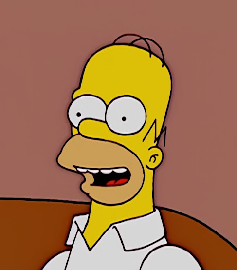
For example, when THE SIMPSONS completely switched to digital tools for their animation in Season 14, they actually applied filters to the animation to make it look like the older technique was used.
In practice, they do things like add a the drop shadow underneath the digital cel to maintain authenticity. It's a shame that THE SIMPSONS was the only show to do that. Shows like King of the Hill and Ed, Edd & Eddy never used filters for their cels during the digital transition.
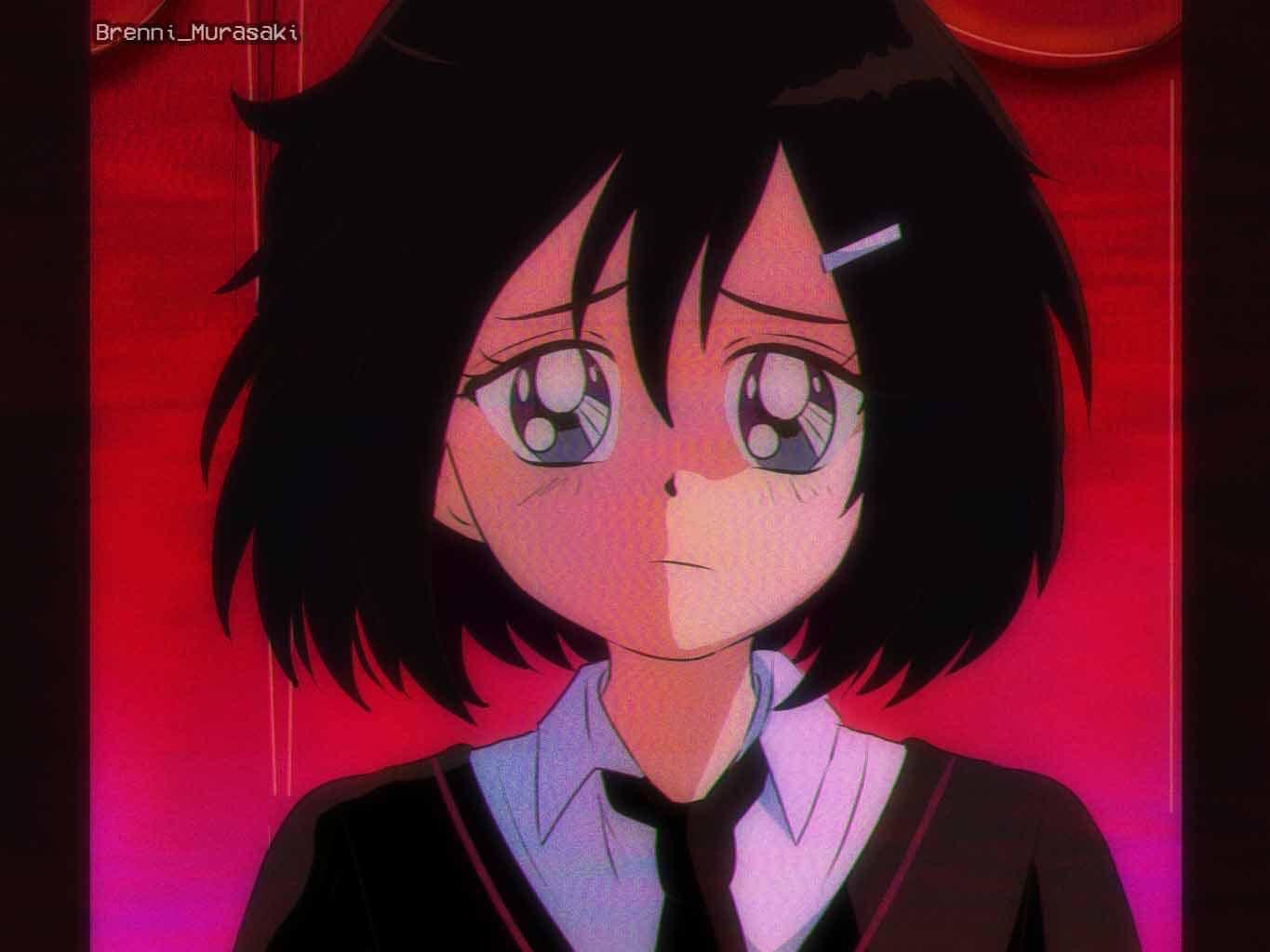
While today's shows don't use these kinds of filters, fanart at least does have the brass balls to add all these filters. There's this guy/gal on Social Media where he/she not only draws in the style of early 90s shonen art style but also uses tools and filters such as brush presets that mimic pencil lead, paints over the outlines, add film grain and drop shadows.
Such as these two fanart pieces that feature Peni Parker from Spider-Verse.
And yes, I have had my share of filters to get that grainy old style 80's/90's look but the way I do things is a little different.
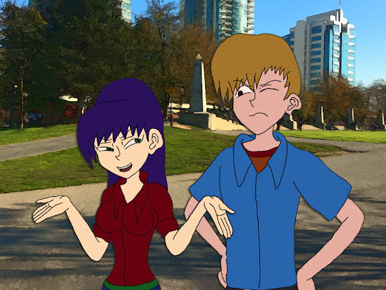
For one, My artwork uses higher contrast colors because I don't believe in pastel palettes so high contrasting colors are the only way for me to go. Though you can tell that the artwork below has had the saturation turned down a notch which explains the faded saturation on Megumi's skin tone and the dull yellow on Hayden's hair but at least Megumi's face and skin tone read better since it's a lighter shade than the dark red for her shirt and dark purple for her hair.
Hayden can be a bit hard to read though so I'll have to explore more ways to make both characters read underneath their high contrast color palettes.
Another is that my art looks like those animation pieces that have been restored for a 4K resolution just because they use the original 16MM or 35MM masters.
That's because I used filters in Photoshop to mimic that look and yes, I combine all my layers together so I can apply the grain filter and get that restored 35MM film stock look.
But what about mimicking VHS quality?
Photoshop does have a filter to do that though I'm not satisfied with my results... but here you go.
What about the animation side of things?
Well I can't get the film grain to play ball with me on Toon Boom.... yet.
At least I can get the drop shadow to work.
And believe it or not, I have some screen captures of when I worked on this animation piece.
This screen capture was taken 5 monthes before I built my PC. This was taken on my MSI Laptop which ran Windows 10 Home.
I now use my Maverick PC running Windows 11 Pro.
This is the workspace I used for the SHASTA RUN. The Top was Screen was my main monitor while the bottom was my WACOM ONE Pen Display. The top is used for reference and to check the animations as well as work on nodes while the bottom was to animated my character by hand using my WACOM Stylus.
Back to the nodes though, You may notice how the nodes look.
I have a peg labeled Shasta-P which is to hold the cels together.
I also have composites to hold all my nodes together as well for other things to.
The TVG nodes are my actual drawings while the shadow node is the drop shadow.
And you may notice the TVG node labeled DRYBRUSHBLUR. Yeah, I wanted a DryBrush Blur so i created a separate Vector for the dry brush, added it's own shadow, composited them together and combine the cels of both Shasta and the drybrush under one peg.
All to create this:
Yeah, that's how you do drop shadows and drybrush on a digital space.
I'm still working out the kinks to get the film grain to work properly as well as do some kickass multiplane camera scenes which I'll cover in a blogpost in the future but at the moment, I just want to do a quick post about cel imperfections and maintaining artwork authenticity since every once in a while, I see modern animation who's digital cels look too synthetic for my tastes, or that show uses those blasted Puppet Rigs with templates or evenly shaped outlines with no line weight, etc.
And then shows like THE OWL HOUSE, MY ADVENTURES WITH SUPERMAN, and most recently SCOTT PILGRIM TAKES OFF showed up and suddenly, my passion for animation got reinvigorated.
It's going to be a long way for me to go with these posts before I'm really ready to show off a production bible for my own series concept and keep everything intact without executives vetoing everything I worked on for this show.
But until then, I'll continue to study more about old-school 2D animation techniques and learn more from them and apply that knowledge to my animations.
On a side note, My birthday happened 3 days after this post....
HAPPY BIRTHDAY to myself....
Also, I'm going to be more active with my own art now that I've finally purchased that Lexar SD Card reader for my PC.




No comments:
Post a Comment