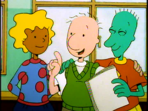
Season 3 of DOUG (Nickelodeon Series that is) is considered my top favorite season of the show. To me, this is where the writing has peaked as well as a shifted color palette to a more higher contrasting palette compared to the purple hue of season 1 and the pastel palette of Season 2.
This higher contrasting palette would eventually carry on to the 4th season as well.
By the time Disney took over the show, the colors became more vibrant but less Contrasting in colors so Seasons 3 and 4 of Nickelodeon's DOUG looks very good to me, even in 480p DVD quality.
So why am I so obsessed with Seasons 3 and 4 of DOUG? Because like I said, better writing, better colors, and Season 4 made Billy West's Doug Voice sound deeper, sort of like a prototype of Fry from Futurama.
But color is the most important part of this Blogpost.
Why am I obsessed with High Contrasting Colors?
Because to me, Characters need to stand out when compared to the background art.
I can't fathom why when I see 2D Animated show, hand drawn or puppet rigged, the people behind those shows always go for a pastel palette.
I get it's to make things soft and fuzzy for the children but if a show is dictated by the color palette and it has to be soft and gentle, there's not point to be immersed into something where the characters are going to get lost in the background.
Like I said, DOUG's 3rd and 4th Season from the Nick Era has the best color palette there is to offer. The character's color cel paints are more vibrant than the background art which is good thing since it helps them read better which is important because the main focus of a cartoon or anime is a moving character.
Of course, Judging by these Screenshots from the Silver Skeeter episode, the colors looked more like a holdover from the Second Season. I think I may have put in the wrong Disc from my COMPLETE NICKELODEON SERIES DVD when I took these screenshots.
But when done right, You've got characters who read much better and are the focus.
The Colors are still dulled when the title character has his trademark imagination sequences but when that's to be expected.
Roger picking a fight with DOUG's pimples on who gets to order the PANORMOUS Pizza at their local PIZZA HUT.
I don't know about you but I think the mid-90s for animation when done right by the animation studios provided the best palettes in cartoons and Anime.
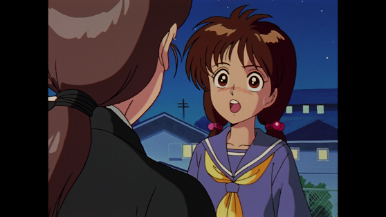
Here are some screenshots of the best palettes to offer in animation back in the 90s.
Yu Yu Hakusho
Ranma 1/2's OVAs often have a much better color palette than most episodes due to not using the main television production units as well as better drawings than most of it's episodes.
For Disney's Recess, I often prefer the episodes that use Acetate Celluloid instead of digital ink and paint due to a higher contrast of color palettes.
But back to DOUG, The first half of the 3rd Season of the Nick Series had that Pastel Palette that drove me Crazy most of the time
"Don't diss the Pastels Doug!"
But by the time of the Magic Meat episode, Jumbo Pictures decided to change gears with the colors and give us the High Contrasting Colors I so demanded
Just look at how Colorful these Season 3 and Season 4 Screenshots look.
And yes, These are from my Complete Nickelodeon Series DVD because I demand the best quality screenshots without faded colors or infernal watermarks.
Pretty good for a cartoon that strictly uses the old school style of 2D animation which was Xeroxed outlines on acetate cels and acrylic paint.
While the Disney series stuck good to it's promise never to touch Computers for it's animation cels
aside from screenwriting, Animatics, and final editorial on AVID, it's clear that something has changed.... actually there were a lot of changes that elicited mixed reactions.
Billy West's salary dispute aside, the major change on Disney's Doug that I have mixed feelings about is the change in the photography process.
The series is really colorful but I still think changing overseas animation houses from HanHo Heung-Up to Mike Judge's PLUS ONE was unnecessary in my part.
Don't get me wrong, As a DOUG Superfan, I like both series for their merits in the Creator-Driven Animation space but if I were to use DOUG as an example of Color Theory and what palettes to use, I highly recommend the Third Season from the Nickelodeon era.
By the way, the DVDs for the Nick Series are no longer available on Amazon which is where I got my DVD in 2019.
But you can still watch all 52 episodes of Nickelodeon's DOUG on Apple Tv and Amazon Prime.
(Paramount+ has since removed the Nick Version from their service.)
As for Disney's DOUG, you can find all 65 episodes on Disney+. So.... yeah.
And how's about a Little Joke:
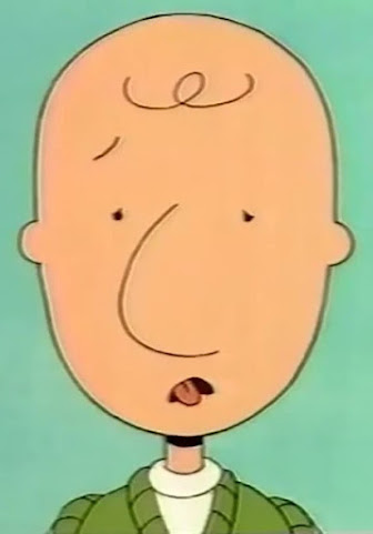
Doug's reaction to his New Voice after Billy West's salary Dispute
Or even better since the joke's from the Nick Series:
Porkchop's bias against Roger's New Scream:
"Porkchop does not approve of screaming Rottweilers."
That above Image is pretty funny because Roger's Disney series scream originated from the GUARD DOG episode and it was used for the titular guard dog Lady the Rottweiler. What's more funny is Porkchop's NO NO NO animation coming after that imagination sequence which makes it all the more funny.
And here's the camera recording of said scene. Now you can see in full-motion why I find this imagination sequence transition so funny.
By the way, the name of the Scream that's used for Lady the Rottweiler as well as Roger Klotz's Disney Series Scream is called:
and apparently, it was recorded back in 1989 before Doug made his debut on Nickelodeon on August 11 1991.
When I originally wrote this post back in January 2024, It started snowing like crazy in Vancouver. Seems like the weather decided to catch up after El Nino after all.
I guess that means more blogposts as well too and I can guarantee that DOUG may be the focus of it after all.
I still will rely on my Nick Series DVD for most of my screenshots and I guess for my Disney Series screenshots, it's going to be the DOUG WIKI and my iPhone 15 Pro Camera pointed at front of my ASUS TUF Gaming Monitor screenshots too as I've got no AVERMEDIA capture card and like I said, DISNEY+ disables screen captures so using the Windows App is a no go for my screen captures.
.....
That was the plan when I originally wrote this post.
I've since bought my Avermedia Live Gamer Portable 2Plus as well as a 128GB Micro-SD Card to go along with it so I'll get to capturing when the time permits me to as well as hit that Screenshot Button on VLC Player.
And it seems like Beebe Bluff is this close to wanting to smash my EPOMAKER Keyboard if I don't stop with this blogpost. You know what, that's a good idea.
And in the off chance that DOUG gets revived, Here's my advice: NO PUPPET RIGS!!!
DOUG's art style may be simplistic but I'm fiercely a strong advocate for old school hand-drawn frame-by-frame animation so If the DOUG revival has to use TOONBOOM HARMONY, I want every frame drawn by hand on WACOM CINTIQS complete with all the onion skin tracing and in-betweens there is to offer.
But what I do want is to replicate the drop shadows you get with acetate cels and fortunately, I've got a screenshot on how to do that:
The Green is the Peg which holds everything together as the master controller.
The (tvg) nodes are the drawings. Then there's the shadow node which generates the drop shadows.
The bottom nodes are the composites that hold everything together.
And that's how you create drop shadows in TOONBOOM HARMONY.


No comments:
Post a Comment