Have you ever seen your favorite cel-animated cartoon or anime restored on Blu-Ray or 4K streaming and seen how the cels look.
I know some people would question whether or not it's normal to see all the imperfections of paint show up on the cels since most of us grew up watching these on VHS or DVD and the masters used for those older prints general don't show the imperfections but Blu-Ray and 4K generally use the original 16MM or 35MM masters so it's pretty much justified.
And that's only if the artwork wasn't artificially restored with AI Tools.
I like my 4k Restorations done using the original artwork rephotographed or by using a surviving 16MM, 35MM, or 70MM print available.
The above image is a cel from NADIA: THE SECRET OF BLUE WATER, originally broadcast from 1990 to 1991. As you can see, the paint seems to go haywire and sometimes can slightly leak out of the lineart of the cels.
Such is the life of a painter but you can't help it since many an animation company in the early 90s didn't want to switch to Digital Ink and Paint due to fears of making the animation appear synthetic.
I get where this early 90s mentality came from. Even I could see it from Disney's early renaissance films.
Little Mermaid was Disney's last theatrical film in their main canon to use traditional acetate cels and acrylic paint for their animation.
By 1990, they transitioned to using Computers for ink and paint and compositing.
Despite RESCUERS DOWN UNDER being their very first 100% digitally animated film, the visuals look stunning even for animation. My guess was that the people using the computers applied a filter to the cels or the images to give that filmic feel to the digital cels and make it look aesthetic enough to make people think the company went back to their pre-1961 production practices.
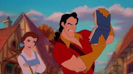
But RESCUERS DOWN UNDER underperformed in the box office due to a lack of marketing and competition from HOME ALONE. On top of that, Jeffery Katzenberg demanded a rewrite for Beauty and the Beast so that may explain why so many flat colored scenes in the film looked pretty much synthetic even with colored lines.

It looked fine when view through 35MM film stock due to how the projector bulbs increase the color contrast but since Disney uses the original CAPS masters for DVD, Blu-Ray, and 4K Streaming, the synthetic look of the colors and lineart are justified.
Really, I don't blame the film for it's cels. Jeffery Katzenberg rushed the production of the film during the early 90s. Plus, Howard Ashman was dying of AIDS so cut the film some slack.
Aladdin is a slight improvement in the digital cels.
Sure, the film has some slipups of Synthetic cels, especially during the scenes of daylight and flat colors but....
Come on. If sometimes you gotta sacrifice some aesthetics if the focus is the genie. He practically steals the show due to the Late Robin Williams' excellent performance.
Of course, as the years progressed, the technology got better and better.
And look where we're at right now!
Jeez. Why did I decide to make a rambling post about my views on Digital Ink and Paint colors and cel presentation.... oh right. The title of this blogpost.
But I digress, sometimes, even with your own digital tools, you lose more than just cel aesthetics. The push for digital perfections also mean you lose the imperfections that were so prevalent in the old style cels.
Ever seen those 90's anime that still use cels? Just take a look at the cel below.
I like the scratchy lineart of Ranko, Female Ranma, because that time, anime companies were style committed to xerography so maintaining that line was necessary for many an animator.
Even when companies had no choice but to make the required switch to digital ink and paint, there were several holdouts that refused to make the switch and stay committed to the old style. And sometimes that actually worked out better in terms of artistic presentation.
For example, DOUG's 1ST MOVIE from 1999 still used traditional cels because Jim Jinkins fiercely believed that acetate cels were the only way to go for animation aesthetics which despite the film's average reception, actually gave out the best visuals in any DOUG property.
In fact, according to the credits, DOUG's 1ST MOVIE only used digital ink and paint to correct the colors on the cels.
Similar to Princess Mononoke in 1997 where it still used traditional cels but used digital tools for color correction, Non-linear editing, and some tiny bits of CGI.
RECESS SCHOOL'S OUT from 2001 had a much better critical reception than DOUG's 1ST Movie
But the digital cels to me were a representation of a time when color artists for film and tv abused the hell out of the brightness settings in software which resulted in the cels looking like a product of the time they were produced.
"Uh Oh. Someone insulted our digital cels. RUN!!!"
Though the digital ink and painted cels in Recess School's Out were still 10x better than the episodes that used digital ink and paint.
"Don't compare my digital cels to the TV series. The argument will get you nowhere."
There are also animators or artists that I know that have fully embraced digital tools for art (Except for AI) But they still prefer the earlier look of the imperfections of cels so we do our very best to emulate that look using the software of their choice.
If you've been following the independent animation scene, then you know about MUSHKA, Andreas Deja's independent short he's been working on for the last 10 years.
It stars a Ukrainian girl in the 70s who adopts a Tiger for a pet but as the tiger grows up, it becomes a burden on the girl.
The film has a very scratchy line art feel because Andreas Deja grew up watching Disney's xerox era films and to him, the scratchier the outlines, the more artistic the integrity of the film is.
It also helps that one of his favorite films is THE JUNGLE BOOK so with the model sheets, his many years of experience in animation, as well as his favorite film being from the Xerox era, he chose that look for the film.
Please forgive the cursor on the capture. I pulled the image from IMDB but the website won't let me save in JPEG or PNG so I had to use screen capture for this.
As for me, I don't believe in perfections in my art. To me, the more imperfect the line art or color enclosure there is, the more personal the artwork is.
Of course, sometimes my tools for my art evolve to the point once I experiment with a certain technique, I will eventually stick with it on the long run.
For example, Here's an above cel for one of my own art featuring my original character Hayden Brentwood as he is surrounded by a bunch of girls.
This was in 2019 when I drew and colored this and I used to use thicker outlines and more neutral colors.
Why is the background off-white? Well I didn't have a Wacom Tablet at the time I drew this. They were drawn on my Nintendo 3DS using an app called Colors!. I export the art to my computer and then into photoshop where I removed the white background and composite the cel on a background.
Anyway, I've changed my style as the years went by where I finally decided to stick to thinner outlines in order to maintain aesthetics on my own art.
I may have better technology such as Wacom Tablets, AMD Ryzen CPUS, Nvidia RTX 4080 GPUS, etc but I will never abandon the tools I originally used for my own artwork. Sometimes there's a certain charm to your original tools that you can't replicate with your older tools.
However, at the moment, I haven't done much newer digital art. Either on my computer or my Nintendo 3DS. The reason is not because of the earlier Hollywood strikes or the rise of AI Art and the controversy relating to it but the real reason is the MicroSD card reader i had from back in the day crapped out on my during the Summer of 2023 and considering I've moved all my PC stuff from my laptop to my custom built PC, I feel inclined to use my laptop to transfer my art from one system to another. In Around December 8 2023, I got my paycheck from work and I went and bought that Lexar 3-in-1 SD Card Reader so now I can do more art..... sort of.
I'm thinking of switching my painting model to Photoshop but only time will tell if I do that.


No comments:
Post a Comment