Wednesday, October 25, 2023

Mind Blown Peanuts-Did you know Lucy Van Pelt began her newspaper comic appearances as a Toddler? And other amenities.


My oh my. Did Peanuts ever look so different back when it first premiered on newspapers back in the 1950. 

Only Charlie Brown became the original mainstay from 1950 to remain while others such as Shermy were left to rot in the discarded characters file folders.


Also, the signature crude outlines we came to know and love are nowhere to be found. Everything was all thick, lines were cleaner and simpler. 

On top of that, Charlie Brown's head was more or less shaped like a football. 

A good 46 years before Arnold Shortman made football heads popular.


 More like 49 years before Stewie Griffin made football heads popular by the dozen.


Pretty mind blowing to discover how different Peanuts used to be in it's earliest inception but on the other hand, it's not uncommon for characters to look dramatically different when their comics began in it's earliest form.

Take for example the MAD Magazine aesthetic of Lupin III circa August 1967.

Or the original angular art direction of Albert Uderzo in the first Asterix album ASTERIX THE GAUL circa October 29 1959.


Or Popeye's earliest appearances in Thimble Theatre circa January 17 1929 where he was drawn to be his most pissed off at best.

Lupin dropped the MAD Magazine look in the 70s in favor of a more conventional Japanese anime style, especially when Hayao Miyazaki was involved.


Asterix's art style became more Disney-like due to Albert Uderzo being such a Disney fan.
(The art certainly didn't look like Disney but rather drew inspiration to clean up the art.)

And Popeye was made less pissed-off and more rounder in his face due to Fleischer wanting him to appeal to people who grew tired and weary of Mickey Mouse during the 1930s.
Fleischer really knew Popeye appealed towards children so they rounded his appearance.


But wait, there's more. You know what The Simpsons looked like back in The Tracey Ullman Show?

Well around the late 80s, they ditched that LIFE IN HELL look as drawn by Matt Groening and by 1992, they dropped that KLASKY CSUPO influence when they switched to FILM ROMAN.
And during Season 27, they divorced from Film Roman and FOX handled the rest of the animation.


But wait, there's more. DOUG looked very different in both the Pilot Episode and when the title character starred in various commercials.

But then Nickelodeon demanded that Doug and friends be animated with cleaner outlines and they also demanded he have eyebrows so he actually emotes. 


Then when Disney took over, they simplified his sweater vest, wore long sleeves, and made his scalp slightly flatter just to show he's hit puberty.
With his voice unfortunately starting to crack and no facial hair).

But wait, there's more! South Park originally used Cutouts.... actually construction paper cutouts but only for the Christmas shorts and the pilot episode CARTMAN GETS AN ANAL PROBE.
SON OF A BITCH!!! WE WERE USING ACTUAL CUTOUTS?! NO WAY!


But.... well rats... I'm starting to sound like a broken record.

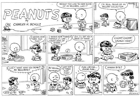
Anyway, back to Peanuts. I've read that a lot of characters who are modern mainstays in the Peanuts actually began their life as babies or toddlers but they were forced by Schulz or his editors to age up these characters just so they be appropriate foil to Charlie Brown.

I get that's how Linus and Sally began their lives in the newspapers but I was quite perplexed when I found out this was how Lucy Van Pelt began her life in the newspaper comics.

If you think Lucy treats Charlie Brown like a sorry sack of pig crap all the time, Good Grief, was Lucy treating Charlie Brown like a badly fermented bicentennial Bordeaux wine.

Only, instead of swiping a football from his underneath his foot or running an unreliable therapy service, Lucy was mishandling Charlie Brown's Vinyl records... by literally eating them.

Not even Sally, Linus, nor Snoopy would have the brass balls to do that because they all know it would piss off Charlie Brown... enough for him to shoot them up with machine guns as seen in Jim Reardon's BRING ME THE HEAD OF CHARLIE BROWN.

I thought I could only find the color version of the above comic but as it turns out, I found the Black and White inked original so it effectively replaced the colored version I had up on this blog post.

I'm actively on the hunt for more oddities based on what comic book or animated characters used to look like before they became what they are now. So stay tuned.

Monday, October 23, 2023

Orson Welles-The man with the baritone

 Another actor to look up to is none other than Orson Welles.

This man, this is the man to look up to when you want your acting fix.


While he did a few films within Hollywood, He's actually more well known for his stage productions of shows like Macbeth and The Cradle Will Rock.

And let's not forget his bone-chilling 1938 Broadcast of H.G Well's War of the Worlds. From what I've read, that radio broadcast was known for scaring the bejesus out of everybody in the USA for making them believe there was a Martian invasion.

Oh and there's his most famous film of all time: Citizen Kane. The story of a newspaper capitalist inspired by the life of William Randolph Hearst told by the perspective of other people in the film who knew of the man himself.

"I think it would be fun to run a newspaper" indeed.

I haven't seen Welles' other films but I personally feel he already did perfectly in Kane.

My generation mostly know him from his many commercial outtakes he's done in the 70s such as Frozen Peas and Paul Masson Champagne as well as the voice of Unicron from Transformers.


But for me, I mostly study Orson Welles for his auteur licenses to his own work, his stage performances, and other things. 

And once in a blue moon, Maurice Lamarche's wonderful impressions of the man himself.

Jack Nicholson-The Perfect model for facial muscle study + Toon Boom techniques I discovered.

 Every artist has their own favorite actor.

Some would say it's Kirk Douglas. Some would say it's Channing Tatum.

For me, I have many, all actors who were in a movie no later than 1999.

But if you ask me what's the perfect man to look up to for facial muscle study, I'm going to say Jack Nicholson.

Seriously, this guy really can ACT. He's been a staple of many a films since he started acting in 1955.

But his career didn't really skyrocket until the late 60's with Easy Rider.


For me, I mostly know him for his performance as Randall P McMurphy in 

ONE FLEW OVER THE CUCKOO'S NEST, 


Jack Torrance in THE SHINING,


The Joker from BATMAN (Though I still prefer Heath Ledger as Joker)


Colonel Jessup in A FEW GOOD MEN,


Just to name a few.


But really, it's the whole Jack Torrance thing I'm most impressed with because I actually look at this one scene from THE SHINING where he's a in a bar. The way he moves his facial muscles during his dialogue and laugh sequences are perfect examples of facial muscle studies. There are other scenes that qualify such as the Here's Johnny and Big Bad Wolf scenes but the Bar Scene is a personal favorite of mine.


One reason I'm getting on this topic of facial muscles is because I need to retrain my brain on understanding muscle studies. The muscle studies I was taught in college were mostly for full body which is fine I guess but really, half should have been dedicated towards the face.

Most of the facial muscle studies go towards two things in animation: 2D Hand drawn and 3D CG facial controls.

The same can't be said about puppet rigs due to the complexity of bones or the constrained nature of the either construction or pre-drawn mouth shapes.

I actually experimented with doing this on puppet rigs using this one rig based on a Japanese video game character. Even though he was easier to manage than most 2D Puppet rigs alongside locking the jaw animation to his many mouth presets, it was still as constrained as I felt.

It's clear Jack Nicholson and Puppet Rigs don't mix.


Oh well, I may have better luck with 3D Animation for this particular voice clip when I take it to Autodesk Maya and do my lip sync and pantomime. 

After all, animation both 2D and 3D is all based on keyframes.

Aside from Adventure Time or Rick and Morty, most puppet rigs generally avoid trying to emulate live-action cinematography in favor of tried-and-true convention for animation. I get that when the tools are readily available, you stick with them but in my opinion, experimentation really matters. I dislike conventional techniques since it's repeating the same tired old trick in the book. What happened to the days of experimenting with new things?

To give you an idea what I'm experimenting with in 2D Animation, I'm beginning to add drop shadows to all my hand drawn cels using the composite and shadow nodes in Toon Boom's Node editor.

Funny thing is, I used to dread nodes due to their complexity but now I've embraced them for their merits such as connecting things from one node to another. Things like pegs, shadows, brightness, cameras, etc.

Forgive the incomplete nature of this post. I was using a different computer to create this post. All my other photos are in my Custom Built PC's hard drive. Once I get my files, I'll update this post.


But no need to worry. If the drop shadow node is interesting, I'll make a post on How I do drop shadows on Toon Boom using the Node Editor.

Popeye meets Sinbad-The Sailorman's first foray into 3-Strip Technicolor(From Fleischer Studios.)

It's tough to imagine this but when I see online photos of Popeye in Color on places like Facebook, I can tell those stills are pulled from what I call the INFAMOUS FAMOUS STUDIOS era.


My guess is why they choose those stills from Popeye's Famous studios era cartoons is because almost all of the Popeye's made by the more superior Fleischer era are in black in white.

In fact, the only color Popeye's that were made by Fleischer (and were originally photographed in Color instead of colorized by Ted Turner) are what are referred to as the Popeye Arabian Nights Trilogy.


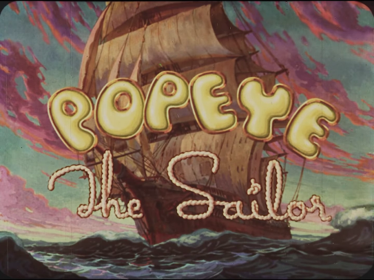
The first entry in the Popeye's Arabian Nights Trilogy is SINBAD THE SAILOR. 


This beautiful short was released in November 27 1936, a good 13 months before the release of Disney's Snow White at the Carthay Circle Theater in December 21 1937.

But back to Popeye, this is a major achievement in the history of the Sailorman. Not only is it a beautifully animated 3-strip technicolor film featuring Popeye but it's also the most lavishly animated of all the Popeyes out there even for Fleischer's standards.

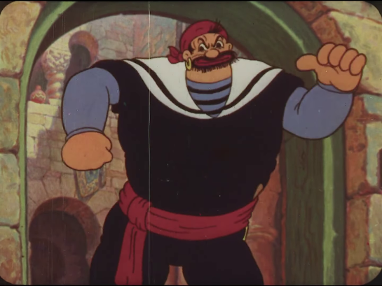
It all starts with this guy:

Is that really Sinbad or is that just Bluto in disguise?

Anyhow, Sinbad is as boastful as Bluto. He sings a self-congratulatory song about how he's the best sailor in all of the Atlantic Ocean.(I have to say Atlantic because that's what we call the seven seas. Plus, Fleischer was an East Coast Animation Studio.)

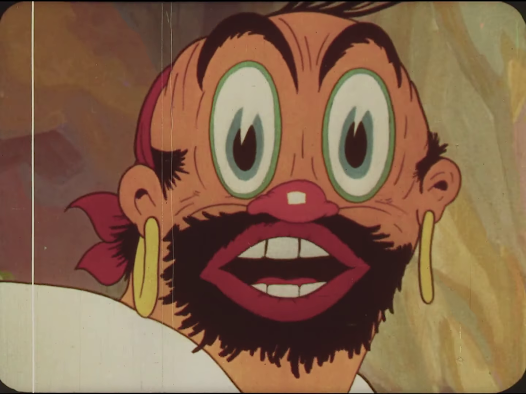
Sinbad is so manly, as he puts it, that animals who confront him cower in fear.

Especially when hits them in the face.

"WHO'S THE ALPHA PREDATOR HERE!?"

"You!!! Sinbad.... the...... Sailor......"

Here's a major highlight of Sinbad, and virtually any Fleischer Popeye short:
The 3D Stereo optical setback Camera.


I really like this camera. It has a much better Multiplane camera feel than Ub Iwerk's more well known system. Why?

Ub Iwerk's multiplane camera system, which he sold to studios like Disney and Warner Bros, is just the same down facing system as the standard camera so the art stays flat no matter what. It's good for assets that don't have that much detail such as the cacti and mountains you see in Roadrunner cartoons but If you push for Hyper-realism such as the trees in Bambi's opening sequence, your art is limited to a fixed perspective.

Fleischer's setback camera on the other hand uses Actual sculpted 3D Assets which are placed on a turntable. Of course, this means the animation has to be photographed horizontally but that's a trade-off when you want to do 3D a good 60 years before computers could let you do that.

Did I mention that everybody is scared shitless of Sinbad's manliness?


Not even a two-headed giant is a match for Sinbad's personality.

Nor a Roc.

"Not even any other man could stand up against this menace."


"SPOKE TOO SOON!!!"

Sinbad is not amused.


OW!!!


So he sics his Roc at Popeye and the gang.


One of the many reasons I like Fleischer's setback camera better than Iwerks' Multiplane Camera.

The perfect blend of 2D Animation and 3D Backgrounds on a turntable.

Nowadays, if your software supports it, you can do this on your own computer. Just as long as you have a multicore CPU, high-end graphics card, and at minimum: 32GB of DDR4 RAM.

Popeye's ship has sunk.... err....umm.... RAN AGROUND BY A GIANT BIRD!!!
As usual, Popeye is absolutely pissed.


Another Fleischer turntable marvel.

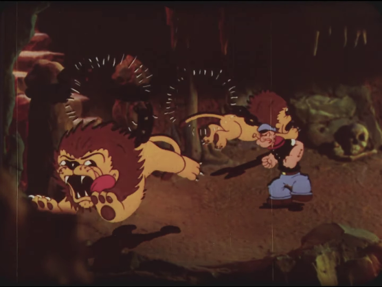
A look. LIONS! Will they scare Popeye?


NOPE!!!


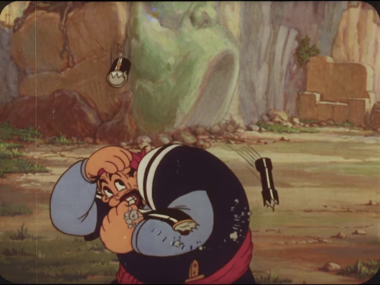
"What's this damn wall here?"

"Welp. Better antic and....."

"Drill the wall like a human drill!"

Sinbad is not amused.

And this is where I'll have to end my post. I actually have more screenshots but if I show all of them, I end up spoiling the rest of the cartoon for you. 

On a side note, You may notice the somewhat yellow and red hues in the screenshots.
That's because I'm using the National Film Registry print of the cartoon.


There's actually a version of Sinbad that's on DVD but unfortunately, whoever was responsible for that restoration thought it would be a good idea to pump up the purple, pink, and cyan colors to the maximum.


This DVD color restoration actually pissed off John Kricfalusi, who fervently despises pink and purple since he views those colors as sissy and not manly for his tastes.
In his blog, He accused the restoration team for purposely using what he calls the MY LITTLE PONY color palette... To me, the colors on the DVD version look like they pulled the colors out of an episode of RAINBOW BRITE which uses a pastel color palette.

Ironically, Sinbad's outfit was originally Purple but neither the DVD or the National Film registry print show that.

My guess is that the original Purple outfit Sinbad is in the Thunderbean print but I can't find the Thunderbean print on ARCHIVE.ORG and the .mp4 file found in there uses the DVD print which has that pastel palette.

Seriously, that pastel palette looks way out of place for a 3-strip technicolor cartoon released in November 27 1936.

Look, I get that a lot of Fleischer's Popeye cartoons are in the public domain but at least show absolute respect to the people who worked their ass off in the 1930s when painting and photographing the artwork by handling the restoration which means get accurate colors and keep the lineart intact. It pains me to see Disney's 1930's color shorts use that Gaudy pastel palette but what pains me even more is when I see prints of 30's and 40's cartoons that have accurate colors but instead uses AI upscaling instead of finding the original 16MM or 35MM prints when restoring them in 4K.

Luckily, Popeye's aforementioned Arabian Nights Trilogy are the only Popeye's in Color during the Fleischer era. 

Here are sneak preview posts for other color Popeyes(Still Fleischer era only).

And you can also see the how better handled the colors were on these prints... barring a few exceptions but those are for another post.