You just have to pay attention to what techniques were used during production.
Some go for Hyper Realistic.
This is obviously a Matte Painting of Cloud City from the
original 1980 Theatrical cut of
STAR WARS EPISODE V: THE EMPIRE STRIKES BACK.
Some draw it in the same style as the animation cels with little to no detail or shading.
The list of BG Design staggers.
It just depends on what production you're looking at. How good the artist is, etc.
The examples I've shown above are just examples without a heavy explanation.
But now, I will get into the nuts a bolts of the various different BG designs, their logistics, their pros and cons, etc.
And it's not limited only to the styles of Backgrounds you see in Cartoons or Anime. It's also going to cover the color palettes, the moods, etc.
01. Stylistic but functional.
This is a style based on the BG Designs of the 50s when TV Animation was starting to emerge and the need for less realistically designed characters and Environments were kind of mandated in order to cut down on costs.
Some go for designs that while they are abstract, they still hold semblance to the real world environment. Just not as semi-realistic as the artwork has traditionally been back in the olden days of animation when it just dipped it's feet into 3-Strip Technicolor.
It all depends on what style of stylistic you want to go for.
Some use a mishmash of shapes
some use curves,
some are in the style of Pencil Crayon Textures,
the list goes on and on.
This is a style of BG Art that's preferred by several animation studios like DISNEY ANIMATION.... until they mandated ALL-CGI for their theatrical films.
It's also a style championed by many anime studios in Japan where artists are told to make BG Art realistic but not too realistic, otherwise, it be hard to tell if it's a painting or if it's a photograph.
I'm more mixed on this kind of BG Design.
It's beautiful when done by the right hands but it's expensive as hell. The fact that Disney was at great lengths to prefer BG art like this was maddening.
Plus, this also had an effected on certain Multiplane Camera Sequences making the artwork seem less Three-Dimensional than what the camera was aiming for.
All the multiplane camera did was simulate the feel of parallax where the closer to the camera objects move faster compared to objects further away from the camera.
But when Hyper-Realistic Water Colored BGs are pushed, the limitations of 2D Art become more apparent.
Maybe that's why Disney Artists in the late 90s resorted to MULAN's Faux-Plane and TARZAN's Deep Canvas for a more proper 3D Feel to the BGs.
This is a trend that may have started shortly after THE SIMPSONS debuted in 1989 but really got popular when FAMILY GUY started to champion BG art like this.
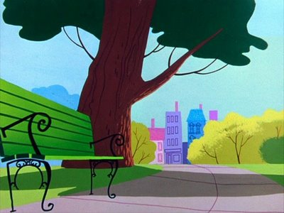
This is basically where the artwork is drawn with just outlines and then the art gets colored with just solid colors and with little to no detail.....
This technique is not new. It's been used to death since the beginning of the medium dating back to the days of Windsor McCay's Gertie the Dinosaur.This was before it was mandated to have all the BG art be painted with brush strokes and characters on acetate celluloid.
But the simple shaded BGs lived on in PERSPECTIVE shots where the animator draws a shot in perspective like it's a 3D camera.
Long Before CGI supplanted that with either Cel Shading, raytraced geometry, or even CG with painterly brush strokes.
Long Before CGI supplanted that with either Cel Shading, raytraced geometry, or even CG with painterly brush strokes.
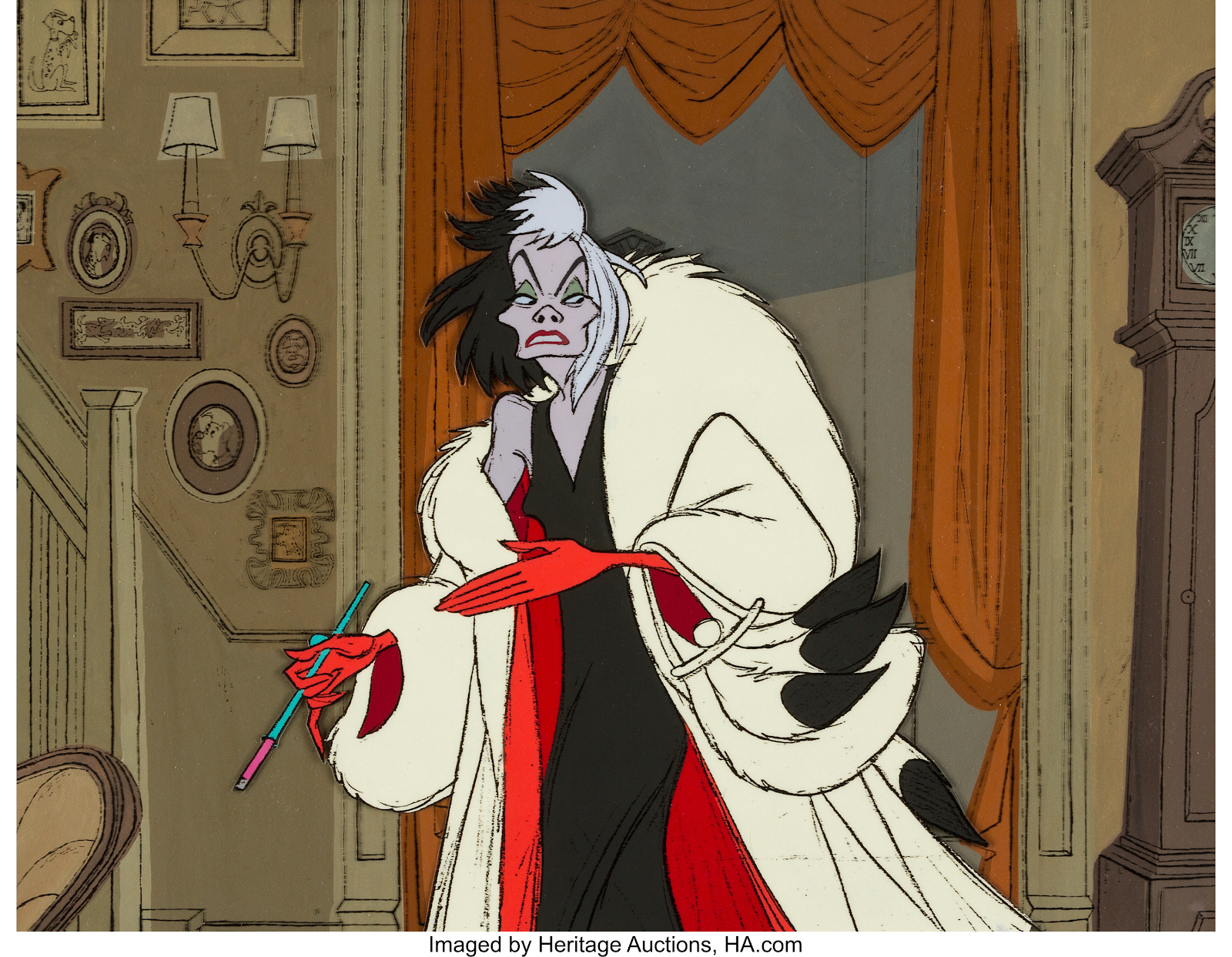
Don't say that the BGs in films like 101 Dalmatians count because while that uses the same Graphic style akin to the XEROXED cels, the BGs are still sort of painterly while the outlines are just an overlay.
Even Cruella knows that the BGs are just as painterly as the old school BGs. Just that it's more stylized and it's got some outlines to retain some semblance of detail
The same could go for the BGs in both Nickelodeon and Disney's DOUG where despite some usage of Black Outlines in the BGs, there are still semblances of brush strokes and texture on the BGs.
Like this screenshot below of DOUG's identical outfits Wardrobe. Despite the 480p resolution of this screenshot, you can actually see all the brush strokes on this BG.
Once again, using Nicktoons Screenshots because Fandom
and also ease of getting screen captures via DVD and VLC Player.
04. PainterlyThis is where you actually want detail but not too detailed like Disney mandated when 2D was still king. Nor do you want abstract or stylized.
The paintings in this category have all these lovely brush strokes that look real nice and beautiful when you take a look at them.
Since the list would be long and dry if I try to explain, instead, I'll show some lovely painterly BGs as part of this category.
Sometimes the BG art doesn't need representation or realistic formature so some shows would rather do this thing where you just need Color Cards to represent the BG art.
I can't find every example out there in the known realm of the web3 based INTERNET so the above screengrab from Ren & Stimpy's BIG HOUSE BLUES will have to do.
According to John Kricfalusi on his blog JOHN K STUFF, John admitted he's terrible at BG art, even when aiming for that lovely stylized 50s BG art for REN AND STIMPY and he was sorely lacking a BG Artist for BIG HOUSE BLUES so he did some of the BGs himself the best he tried to do.
And this also led to some rants from him about how other animation studios were using REN AND STIMPY as a template for abstract BGs in other shows.
(I'm looking at you TODD WORLD.)
06. Tracing from Real LifeThis top image from Fritz the Cat doesn't look like it fits the category of tracing from real life but it does. According to the WIKIPEDIA page on FRITZ, the WATERCOLOR BG Paintings were actually traced from actual photos taken by BAKSHI Productions BG Designer IRA TUREK
This level of using Watercolors combined with the Rapidograph technical pen preferred by ROBERT CRUMB allowed FRITZ to portray a level of stylized realism that was virtually unprecedented in animation... at least in early 1970s standards.
07. Literal Photographs(AKA pulling a Ralph Bakshi)
If painterly, abstract, stylistic, or others aren't going to cut it due to budget or preferences, then using actual Photographs is another choice but for me, it's more of a last resort.
This style of using unmodified photographs has been a staple used in some Ralph Bakshi Movies such as HEAVY TRAFFIC, COONSKIN, American Pop, Last days of Coney Island, etc.
Where to really set up the gritty feel of New York or the Southern States, literal photographs would be used with little to no modification.
Here's Michael and his black girlfriend Carole
enjoying a night performance of Maybellene.
It's a quick and dirty hack so I wouldn't really encourage it all the time.
That and the inherent limitation is NO MULTIPLANE because photos are just an entire merged image as capture by the Camera's Shutter or in today's digital standards: THE CCD Sensor.
This technique has also been used in some other PROGRAMMES such as the short-lived FOX animated series SIT DOWN, SHUT UP from 2009.
As for me, yes, I've been using literal photographs based on my Vancouver Home Town but whenever I take my photographs, I always use PHOTOSHOP'S filters to try and make the photos look more painterly so it looks like it was painted.
This is a modified photo of my High School BRITANNIA SECONDARY SCHOOL.
I picked up this Photoshop Filter Technique from working on the Yearbook.
And yes, this photo eventually got used in the 2015-2016 Yearbook
So far, my results have been mixed but it's certainly better than SIT DOWN, SHUT UP's method of just leaving the photos untouched. Maybe that's why FOX cancelled the show because of the stark contrast.... that as well as the jokes being a turn off for both critics and audiences.
Miracle and her son are ignoring Larry Littlejunk's rants about superimposing digital cels over unmodified photos for 2D Animated BGs.
I wish I'd do a retrospective and critique of SIT DOWN, SHUT UP, but the goddamn thing is not on Disney+ through HULU. And I've heard it's been removed from TUBI.
I'm guessing both DISNEY and TUBI think the show is as aberrant as FOX claimed so that's why it's not available for streaming outside of ARCHIVE.ORG.
And thus ends this post about BG Design.
You'll be happy to know that the examples of BGs I've provided are
NOT AI GENERATED.
I fiercely believe in Hand-Painted BGs and Multiplane Assets whether it's physical or done on the computer with a WACOM CINTIQ.


No comments:
Post a Comment