Notice:
This is the original Xerox post when I had less amount of info and relied on my personal findings. I have since updated this post with a new version as of May 2025 so if you want to see the updated version, here's the link to the updated version.
If you still want to read this version? Then go ahead. What's stopping you?
In the mid to late 1950s, a new technique was created by Xerox Holdings Corporation.
With this, the need to copy one's writing or use a printing plate was done for as with the combination of ink toners, photosensors, lithographic plates, and drums, you can copy a document without the labor required on your wrist whether it's writing or hammering down ink.
But what does this have to do with animation? Well this was a something spearheaded by Ub Iwerks who not only sold the idea to Disney but to every other animation studio in the world
(Mostly through influence and economics.)
I can hazard a guess why the industry moved to Xerox for their cels back in the 1960s but the reason is twofold, one is that the economic recession of 1958 hampering the costs for animation but another was the risk of diminishing returns, especially with the box-office bombing of Sleeping Beauty in 1959.
Don't worry Aurora, In the future, we'll recoup the losses through home video.
There were many upsides and downsides to using Xerox.
First the upsides: It quickened the inking process.
The old style of inking was, draw the character, in-between the roughs, pass it on to the cleanup department, then pass it on to the inking department.
Admittingly, this is my inking but it illustrates a point. And this is actual pen inking, not Xerox.
The result was a beautifully crafted cel that's passed on to the painting department which in they turn the cel backwards and paint the acetate with acrylic paint. Churning out the cel layer seen below.
However, hand inking was and still is laborious and risked strained wrists.
So with Xerox's lithographic technology, it was a matter of taking the cleaned up drawings over to the xerox department and photocopy them into acetate.
With that, it freed artists from the strained wrists and quickened the inking process.
And then there were the downsides.
Because of the ink toners, cost of color toners, as well as the push for much cleaner drawings from the very start before inking, Xerox got a bad rep from people like Walt Disney, Martin Rosen, Albert Uderzo, John Krisfalusi, etc. Why is that?
Well, If you look carefully at this cel of Pongo from 101 Dalmations, which I encourage you to click on, zoom in to the cel,
You'll notice the scratchy line-art that's about to escape from Pongo. Nowadays, one will defend the scratchy line as passing it off for Pongo's short fur but back then, artists such as Walt would criticize the scratchy pencil lead lines for actually being copied off from the penciled cleanup due to how ink toners work.
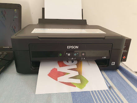
Did I also mention about the cost of color toners? Let's use a computer printer as a metaphor.
We all love to print but in order to print to paper, you need ink. But just like ram chips, Ink costs money.
Take a look at these ink cartridge prices. Insane!!!
The above example was for INKJET printers but I can guarantee that the same terminology will still apply for Laser and Eco Tank Printers too.
Well, the same issue with ink toners applies to animation too. Many old-timer animators love their colored outlines but many ink toners couldn't do that and even if they could, they cost more money than you could imagine.
So for the majority of the 1960s to the Late 1970s, colored outlines were not possible.
But alas, in defense of Xerox, and the lack of colored outlines, many an artist managed work arounds to their art and some even defended the switch to Xerox because it made capturing the scratchy aesthetic of comic book inking feasible. See the screenshot of Goemon from Lupin III as an example.
By the mid 1970s, advancements in toner technology advanced to the point that it was possible to used colored outlines again, starting with films like THE RESCUERS and later branching out to films such as THE SECRET OF NIHM & AN AMERICAN TAIL.
However, here's my two cents on this.
The colored outlines you see in those films are a lie. Ink toners don't separate the colored outline like you could in traditional inking or paint bucket tools in today's digital tools.
Here are my theories on how the colored inking worked for these films.
One is that the ink toner has to be selected for a specific character cel before the xerox process and that has major issues if you use a character such as Mr. Grand Mouse above. Brown toners would work for his fur but not his dark blue suit. Same goes for Miss Bianca and her white fur which would necessitate the gray outlines but would conflict with her pink clothing scarf and hat.
If you were using Miss Brisby from NIHM, that's a different story. Brisby wears nothing but a red cloak so the color toners for her brown fur would work due to sharing the same dark hues for red and brown
My other theory for the colored ink Xerox toner fluff is that I think what's going on is that the toner actually is still a black toner but it's reprogrammed from a DEC PDP/11 Computer to lower the opacity of the black outline to achieve that colored outline effect since the cels are painted on the underside of the inked drawing.
Once computer animation systems from the likes of Pixar, Sun Microsystems, and SGI came along, it was finally possible to not only get clean outlines but also colored outlines.
But is having a digital cel kept inside of a computer's hard drive platter or SSD worth the transition?
Just as people back in the 60s to 80s who complained about scratchy Xerox and asked what was lost from the last several years, you may ask, what was lost once animation went all digital.
Well, here's my two cents on the issue. I read on Wikipedia that many artists like Don Bluth and Jim Jenkins at first didn't want to make the transition to digital ink and paint.
They're arguments was that animation on a computer felt too synthetic compared to the aesthetic feel of hand-inked or Xerox cels with textured acrylic paint on the back of each cel.
I can see where this argument is coming from. This is due to how large the gap and affordability on computational capabilities was back in the 80's and 90s.
Back then, the public could only afford Commodore 64s or IBM PC compatibles since the machines used for digital animation was way out of reach financially for the average schmuck.
And even when affordable computers such as the Commodore Amiga gave us software to do animations such as The Rescuers, their presentation still did not look aesthetically presentable compared to what you could do on a RISC processor.
Fast-forward to now, you could do all that same digital animation on your modern day x64 machine ranging from an AMD Ryzen 5 to an AMD Threadripper and an RTX 3060 to 4090 GPU. All it costs is a few thousand dollars to build your machine and get the software and that's that. What was originally done on machines that cost as much as a new high rise apartment suite can now be done for a few thousand dollars. Unbelievable.
But again, the synthetic cel feel, I can see where this is coming from.
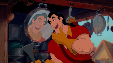
As amazing and beautiful as the 1991 animated version of Beauty and the Beast is, admittingly some of the digital cels have not aged well when compared to the carefully filtered cels from THE RESCUERS DOWN UNDER from 1990
or even better, the aesthetic feel of this cel of Vanessa from THE LITTLE MERMAID from 1989.
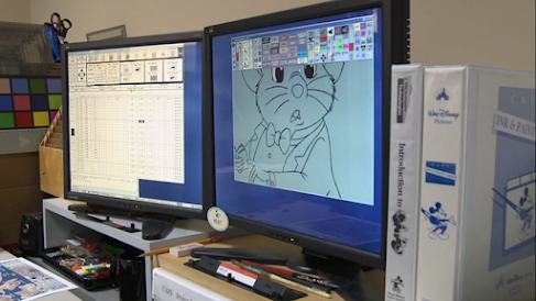
No offense to the awesome Andreas Deja who animated Gaston, though admittingly, he only drew the character but did not color the character on Disney's CAPS computer system.
But compare most of the digital cels from BEAST to those from Aladdin, Lion King, etc.
An example is Andreas Deja's drawings of Scar as seen below.
Andreas Deja, I applaud you for controlling my digital cel aesthetic.
What I'm saying is that there's a sliding difference to how a digital cel looks on 35MM film vs a Blu-Ray restoration using the original digital masters.
Many of us folks grew up watching these 90s Disney movies on VHS and due to our young ages as well as the crappy visuals dealt with on CRT TVs and magnetic tape, we didn't know that these movies were animated on computers but when DVDs, Blu-Rays, and 4K streaming came along, it suddenly became clear what was going on. These films digital formats don't source from 35mm, they source from the master digital file from CAPS which is the masters they used before they export the movies to 35MM film stock.
Maybe that's why integrity was needed to make these films look nice during post-production back in the day so future generations can glance at the digital cels made on systems that we had no financial access to until 20 years later.
As time goes on, sometimes I wonder what was lost when digital animation went from paper scans to Wacom tablets to puppet rigs.
For example, nowadays, it's a mandated by studios to have extremely clean vector outlines on your digital cel. And in order to have that hyper clean outline, it has to be drawn on a Wacom Cintiq.
But for me, I prefer the drawn-on-paper aesthetic, even on digital art.
You may notice in a lot of the digital cels of your favorite 90s Disney Movies, the camera often zooms into the cels and you find that the outlines are not as clean as the animators wanted you to think. In fact, the reality is the cels are still the same rough pencil lead-tip outlines from the Xerox era, it's just that they were scanned into the computer and the outlines were colored using the paint bucket tool.
You can pause and freeze-frame on CAV Laserdisc, DVD, Blu-Ray, Quicktime, etc but the closest to this in full-motion is this still from EMPEROR'S NEW GROOVE.
Yes, this is a screenshot is of Yzma's teeth just to illustrate my point.
Sure, you can achieve that same scratchy outline look with using the many brush tools available in Photoshop, Toon Boom, etc but is it really the same as actual pencil led tips?
That's something you have to ask yourself.
While mainstream projects outlaw messy outlines and off-modelness in favor of perfect vector lines and on-model, many independent projects succeed in getting your intended aesthetic such as scratchy outlines.
Andreas Deja's Mushka is an example. It's animated on computers via Wacom Cintiqs but the aesthetic is 1960's Jungle Book xerox outlines.
Want to know more about Mushka? Go to Wikipedia, IMDB, or even this link to his blog
Deja View.
Ok, so maybe it feels like I'm ranting in the same vein as those people who have 80s/90s nostalgia pages on Social Media who have this "reject modernity, embrace tradition" mentality but at the same time, I don't want to throw away my AMD Ryzen/Nvidia RTX machine just because I refuse to use puppet rigs or generative AI tools.
The whole defense of Xerox, hand drawn animation, wrists, pencil and paper and scanners built into printers is because I care for an artform that's been wrestled by artists vs executives vs mainframes.
That's why I've been so hesitant on making new art for myself and friends. I love digital artwork but at the same time, I don't want to give in to tools that are generated via an x64 CPU's binaries just by typing it them out.
If you want to create digital art but not use AI tools, do yourself a favor, grab a Wacom Cintiq or Wacom One Pen display, go to your Adobe Photoshop, Gimp, or Krita settings and disable all generative AI tools and start drawing, fiddling around with color, filter settings, contrasts, etc.
Do all that, and you have a very nice piece of digital art all to yourself. The only thing your x64 processor does is remember your brush strokes, filters and exporting to JPEG or PNG files.
Holy shit, was this a long post.
Next posts would cover things such as 3DGC FK/IK switches for animating rigs, more color theory, ideal CPUs for rendering, etc. Right now, I need to give my hands a rest before I get carpal tunnel.


No comments:
Post a Comment