Wednesday, September 27, 2023

Nostalgic Amenities-Old Drawings and many more

If you've heard recently, the WGA Strike has ended.... but for how long? It will depend on the situation.

And that's only WGA. The SAG-AFTRA strike is still ongoing so I'm keeping my eye out on that.


Normally, I would divert from this and continue on with a new blogpost about things like CG, Ink and Paint, etc.

Unfortunately, I ain't got shit.


Yikes. I feel you Ramna. But rather than end September 2023 with nothing at all like I had with the other months, I feel it's time for some filler until I can get my head and USB stick going.

So what's the filler? Some of my old art that I did back in the day.


01: Jay's Toys and Games


It has been a while. This was a perspective drawing assignment I did in college way back in the day. My assignment was to draw in 2-point perspective the interior of a toy store.

I referenced the best I could on my iPhone 5S at the time several photos of what a toy store actually looked like and I sketched the best I could the many kinds of toys and floor tiles I could draw.

And to really show the type of toys out there, I drew characters like Mario, Bender, Totoro, Master Shake, just to name a few.

I still have the original drawing but years of storage had unfortunately smudged the pencil marks so I may have to recreate this when I have the time.


02: Vancouver (Burnaby )in the year 2116


Another art school assignment. This was imagining what the city of Vancouver or Burnaby would look like in the year 2116.

Obviously I won't live that long but it's nice to imagine what it would look like. Of course, since I've had my share of Futurama, I tried to keep things a little realistic but at the same time, be futuristic so this is as close as I could get.


03: Draw a dog


This was actually based on a little joke my art teacher in high school often made. So I decided to make this single panel comic on the joke.

I've got more drawings in my disposal but at the moment, I need to sort things out in both my main pc and my laptop as well as my USB since these drawings have gone through hell and high water when they were accidentally erased from my hard drive.

Fortunately, they were recovered using software but that was a long time ago.... back in 2022 at least.

Hopefully this fun little diversion to my drawings will keep this blog running until my writers block is cleared up.

See you in October.

Friday, September 15, 2023

How to draw books-Informational or haphazards

Construction... We hear that all the time when it comes to art.


And no, I don't mean landscape construction but rather artistic construction.


It's sort of the building blocks of constructing characters not just in shapes but also through weight studies.


But to understand construction, you need to study life-drawing.

Life-Drawing, a class in art school where you draw underwear clad models or inanimate objects, that's very important to understanding the weight of the character's construction and I feel it's more effective in helping you draw cartoon and anime characters than those quote-on-quote HOW TO DRAW books you see in dollar stores or dedicated art stores.


It may seem like I'm discouraging you from buying a HOW TO DRAW book but the reality is, I'm trying to guide you to a proper book or PDF instead of those cheapo, basic shape, construction books.


What I do discourage is the aforementioned cheapo books, or what I call
THE BALL CONTSTRUCTION BOOK.


The Ball Construction book is a term for poorly document character construction based on round objects instead of proper construction guidelines. 


Below is an example of a poorly documented construction of Tom the Cat from 
TOM AND JERRY.


I used to have one of these books and at the time, I didn't know these were misguided and poorly documented but now that I'm older and wiser, I now understand how much of a haphazard these books can be in terms of character construction.

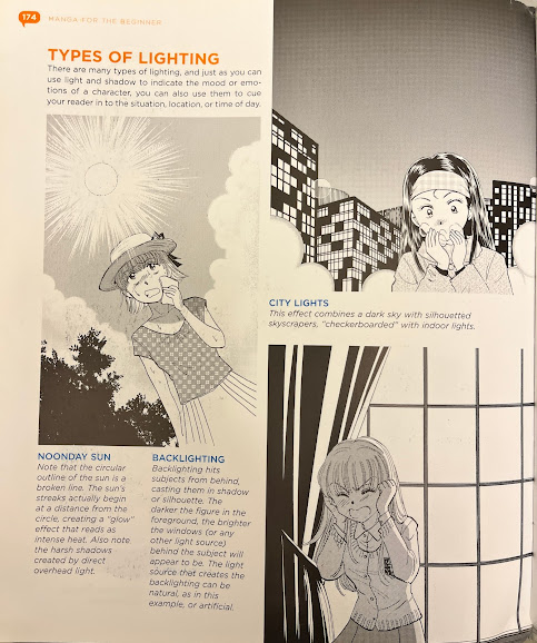
Now here's a page from one of my current HOW TO DRAW books and you can see this is proper construction.

The book in question is a HOW TO DRAW MANGA type of book which according to the author who wrote it, is meant to be an accurate guide to drawing manga style.

If you're asking where I got this book? I bought it in 2014. 
I was in High School at the time and I was in an art class so I needed this book.

That was when I bought it but where did I buy it?

Well, I live in Vancouver so I bought it at this art store called Michael's. Enough said.


But that's not what this books is all about. Sure, it has a better construction guide than your run off the mill dollar store how to draw book.

It also has things such as character weight

Line weight and thickness


Light sources


Emotions


Perspective and vanishing points


Just to name a few.

I absolutely would recommend this book for you. 

If you live in the Vancouver, BC area, you can find this in any Michael's or Opus locations where they sell art.

Or just order a copy off of AMAZON.

Wednesday, September 13, 2023

Anime 101-What it does anime do that's better than it's Western Counterparts in the modern animation industry?


Anime. We hear that many times.

It's a medium to describe animation made domestically in Japan.

It's known for several things:

-Choppy but effective keyframe animation(Best animation is reserved for fights)

-Interesting Designs that vary from artist to artist(Think Akira Toriyama)

-The insane fandoms generated by it......

-It's laxer censorship policies(Meaning that anime can go unaltered and uncensored)

etc.


I recently changed the chassis in my Custom Built PC so I don't have any rants, tidbits, tools and tricks, or others on my plate so instead, i want to veer into the topic of anime.

I've have a deep fascination with the medium due to my ever-growing disenchantment with modern western animation.

Sure, modern anime still suffers the same stagnation of it's western sibling but I'll take it over the puppet rig and calarts style mandate nonsense thank you very much.


But, just to simplify things a bit due to PC Case swap, I'd figure I'll get into the bells and whistles of the medium.

-Keyframe Animation.

There's nothing wrong with your internet connection or your monitor refresh. The above gif from Cagliostro is the actual framerate from the movie.
And most anime movies have a higher budget than their television counterparts.

As choppy as most anime frames can be(it's often animated on twos or fours), I feel the choppiness has the advantage of much better handling of timing the keyframes than most western animation does.

For example, compare the timing from the above GIF from Castle of Cagliostro vs that of a scene from Season 1 of Nickelodeon's DOUG.


-Interesting Designs


In the past, Western Animation dominated interesting designs because characters differed from artist to artist.

Nowadays, it's the Japanese that excels at interesting art. Sure, it's mostly copying styles dissimilar to works from KyoAni or Love Live, but then you have artists like Akira Toriyama, Eichiro Oda, Rumiko Takahashi, and my personal favorite:

YOSHIYUKI SADAMOTO.


Sure, the rules are the same, you have to draw like that artist who created the characters but it's much better than having your own art get discredited by CN showrunners and being forced into the template driven CALARTS style you see so many times in todays western shows. 

But anime keeps everything linked to creator no matter the art style.

Of all the modern anime I see advertised on Facebook, HIDIVE, Crunchyroll, etc, they all maintain that hand-drawn, frame-by-frame style of animation.

Maybe that's one of the reasons I can't watch todays western animated shows due to things like puppet rigged and calarts style mandates forced upon by showrunners.

Every artist deserves to have their own style, not be forced to use an industry standard style.


Ok, so not all modern western shows are bad because I know two shows that are U.S made but follow the Japanese logic of animation, keyframes, poses, writing etc.


And those two shows are THE OWL HOUSE, and MY ADVENTURES WITH SUPERMAN.

I currently don't have any screenshots of those two shows but I do plan on updating this blogpost in the future.


Friday, September 08, 2023

Random Curiosity-Gaston's Chest hair vs. Digital Ink and Paint, and Lum's Hair.

 Gaston. No other manly cartoon character aside from THE RIPPING FRIENDS is as manly as Gaston.


No one is as beautifully digitally colored like Gaston.

No other cartoon character has a real manly voice like Gaston

"I'm actually voiced and sung by actor RICHARD WHITE."


But most importantly...

NO ONE'S AS HAIRY AND VERILE AS GASTON!!!


But there's one thing that's bugging me. How did they accomplish that Hairy pattern on his chest so seemlessly?

You have to understand that Beauty and the Beast uses computers for coloring the cels but back then, while Wacom Tablets did exist back then, they were actually tablets that behaved more like a giant INTUOS tablet. CINTIQ tablets did not exist back in the late 80s to and a majority of the 90s.

So yeah, the pencil drawings were more or less raster artwork fed through those SGI IRIS workstations but as we all know, whenever you use the paint bucket tool on art fed through that, due to the nature of raster graphics, the colors often get anti-aliased and the result doesn't look good.

So my guess is that whoever was the color and inking artist on the CAPS computers back in the early 90s may have experimented with WACOM technology and early vector art to get the patterns correct.

Or he may have done it the old fashion way which was to paint behind the cels but to do that, you would have to create another art layer behind the outline layer and paint that way.


My mind is just boggling with questions on how an effect can be done like that.

But then again, so is trying to digitally color the inside of Butthead's hair, especially with the TITMOUSE produced episodes.

You'll have to excuse the screenshot from BEAVIS AND BUTTHEAD DO AMERICA which was still cel animated but I don't have any screenshots from the Paramount+ series revival.


But yeah, even with today's technology, nobody want's to draw or animated individual strands of hair due to the complexity and instead, would rather leave the hair strands to CGI due to gravity based simulations.

But there is one thing that computers can do nowadays: Iridescent Hair.

Yes, I know it's a little off topic but I've heard that the 2022 adaptation of Rumiko Tahahashi's Urusei Yatsura finally done Lum's hair right... well... sort.

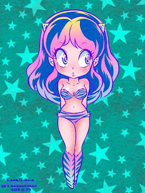
Did you know that Lum's hair wasn't supposed to be green?


It's true. Lum's hair was supposed to be Iridescent, or shifting rainbow colors.

But when the 1981 anime showed up, it became clear that iridescence was next to impossible to do on acrylic paint so they instead colored her hair Green.

This caused many people to think Lum's hair was always green when it should have been rainbow but alas, Technical limitations of the 1980s prevented that.

But 2022 changed all that with Lum's new look.
She still has green hair but it;s more colorful and varied.

BUT WAIT THERE'S MORE:

Whenever she charges up....


She gets iridescent hair.


I've got more random curiosities to discuss once I get every material I have in my USB stick.

Wednesday, September 06, 2023

Colored Outlines-Why use them? When are they necessary, and how to use them.

Starting with the premiere of SNOW WHITE AND THE SEVEN DWARVES at the Carthay Circle theatre in December 21 1937, there came a new normal for traditional cel animation: Colored outlines.

Kind of hard to tell without upping the brightness but the dwarves do have Colored Outlines.

This was a push by Walt Disney to differentiate the animation from his shorts to the film.

In fact, this was thought to be unique to Disney until Fleischer studios decided to do the same for their 1939 adaption of Gulliver's Travels.


Eventually, the technique was adopted by other studios, aside from Warner Bros.

So what's colored outlines? 

It's to give a new feel to the character cels. You may notice in alot of you favorite cartoons that many characters are given black outlines. It's to help provide a minor silhouette and figure to your character.

The characters are drawn on paper first as shown here with this girl.

But of course, since we live in a time where color is required for presentation, we color inside the outlines.

Either on the back of the cel...

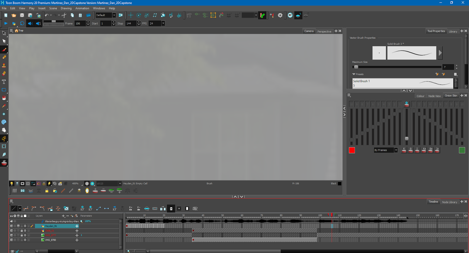
Or through the paint bucket tool on your favorite animation software like Toon Boom.
(As long as the outline is a Vector line. Raster lines get screwed up due to antialiasing.)


But there comes a point in which black outlines aren't enough. So that's where Colored Outlines come into play.

Sometimes, the use of colored outlines can range from partial....

Roxie from John K's unproduced HEARTACHES is a perfect example of partial colored outlines. Everything in her cel is black outlines except her hair.

To full colored outlines.

Both Lilo and Stitch here use colored outlines.
The above is just a lithograph cel as LILO & STITCH uses all digital cels throughout the movie.

Perhaps I should demonstrate how colored outlines are created in cartoons using my own artwork.

Here we have my own artwork in it's non-colored but inked form before the process of coloring the outlines.


Now let’s compare that the same cel from above, only this time, it’s in color.


As you can see, we have color but the one thing that's left unchanged were the outlines. They're still black.

I wish I could change all that but for some reason, my paint program of choice is behaving odd for some reason. NO IT'S NOT THE GODDAMN GENERATIVE A.I TOOLS. 
It's the just the traditional, can't color the outlines without that stupid anti-aliasing thing going on. I'm posting these through another computer because I don't always have access to my Custom Built PC but I can't use a brush tool using a mouse since my wrist is so accustomed to a Wacom Stylus so instead, I'm going to show you another cel I made but this time with colored outlines.
Kind of the same drawing as the rough from earlier but still uses colored outlines.

And lookie here, I've got a cel from my own collection that actually has the color codes, markers, etc.

I also had different shades here to differentiate light source colors.

You may notice in alot of the cels of your favorite Disney movies or others that the outlines use a much darker palette than the main colors. The reason for this is not only because the color artist anticipates the color inside the outline but also the darker and lighter shades used for light sources.

Sometimes, the light source shade colors can be straight up solid shades like this scene from THE RESCUERS DOWN UNDER...


To actual blur shaded colors as seen in this scene of Genie from ALADDIN.
However, keep in mind the blur shadow shading can only be accomplished via the computer.


I will preface by saying that the colored outlines is not a computer thing. Movies back in the day before xerox came around did colored outlines because those cels were hand inked.

However, once Xerox became the norm for animation, the ability to do colored outlines was lost because back then, ink toners couldn't do colored outlines... I mean, they could but the you have to understand that this was the 1960's and Xerox toners for color were still very expensive and I have a hunch the lithographic plates that were originally used before laser printing weren't all that reliable.


And although it was advertised that films like THE RESCUERS from 1977 brought back colored outlines, in my opinion, that's a straight up lie.

I've seen this film so many times on Blu-Ray that to say RESCUERS cels haven't aged well is an overstatement. 

Yes it looks a bit overly sketchy and rough but the fault is due to the gray toners used for most of the cels. 

Perfect for mice like Ms. Bianca but not well suited for humans such as Madame Medusa.

The colored cels were still pushed by Disney into the 1980s when they switched to a new method for Xerography called APT. That's automatic photo transfer for short. 

It's still lithographic but from what I read about this process, it allowed better control of the cels and colored outlines(Probably reduced opacity on the outlines) via photography and sheet film.

The cel of Vanessa from Little Mermaid is an example of sheet film cel transfer.


But by the time of The Rescuers Down Under, the old process became old hat so after the drawings were cleaned up, they were scanned into the computer and digitally colored

Is it just me, or are the digitally colored cels in Rescuers Down Under filtered? 

Of course, that was just Disney, Hanna-Barbera, and Ren & Stimpy.
The rest of the industry for the majority of the 1990s refused to switch to computer coloring due to preferring the aesthetics of hand painted xeroxed cels.

And yes, this includes anime. Of all the anime that I've seen that was released in the 90s, none of them used computers for animation, aside from opening sequences, color correction, and synchronizing English Dub dialogue with an external piece of software
I'm looking at you Ranma. You never used computers, except when Ocean Studios had to synchronize Sarah Strange and Venus Terzo's dialogue to your mouth flaps using WORDFIT.

I will have to say that until today's standards for 2D animation mandated vector outlines, the colored outlines used in Disney movies and a few Warner Bros. films did not use smooth outlines.

If you freeze frame at a particular camera zoom on movies such as Aladdin, especially when the z-axis camera zooms into the cel, you may notice the cel is still as rough of a pencil line as the old style xerox cels were. It's just that they were colored using the paint bucket tool.

Emperor's New Groove however is the closest to have the camera zoom that close to the cel but not only that so that you can marvel at the scratchy pencil lead but also in full motion and longer periods of time. And at Yzma's teeth of all things.
How long has that been in there indeed. 
Honestly, I was paying more attention to the scratchy pencil lead outlines than at the spinach.


Hoo boy, was this an arduous post. It was supposed to be an easy one but sourcing images was a nightmare for me.

Well, what the hell. I have to be committed to making these animation blog posts so yeah.

Next, I'll talk about other topics such as Digital Ink and Paint, sound design, CG, etc.

Tuesday, September 05, 2023

Diminishing Hype-How a film from over 60 years ago predicted the current state of today's cinema

 What does Disney's SLEEPING BEAUTY from 1959 have in common with the state of today's cinema?


As far as we all know, 2023 has not been a good year for cinema. 

Maybe the above sentence was too nice of a paragraph. What I really meant to say was that 2023 has been an ABSOLUTE SHITSHOW!!!! PERIOD!!!!!


SAG-AFTRA strikes and executives refusing compensation aside, the movies that have been premiering in theaters have not done well either commercial or critically. 

By that, I mean, the films out there are no longer balanced with either critical praise or how much money is being earned in the box office.

An example is Dial of Destiny shown above. The film is not as bad as Crystal Skull was in 2008 but it will never return Indiana Jones to 1980s level of awesomeness.

Then there's this thing shown below.

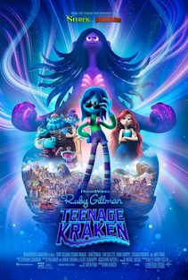
Goddamn Modern DreamWorks executives really don't give a shit about the studio's past edge and instead go for safe family fares... To be honest, I never seen Ruby Gillman but I heard it's a good film that unfortunately was mismarketed. 

And then there's the gloat of films and tv shows from Marvel, Lucasfilm, DC, etc. All that have tried so hard to win audiences but instead backfire on them.

The only films that have really earned universal praise both commercially and critically are things like Super Mario Bros, Spiderman, Oppenheimer, Barbie, etc.

To be honest, I don't like Barbie, and I don't have any Oppenheimer images so instead, I'm using this screenshot from THE SUPER MARIO BROS MOVIE.

The culprit for many movies faltering is DIMINISHING HYPE!!!

What is DIMISHING HYPE?

It's when a movie gets hyped or overhyped both within the studio and with the general public.
It's when a purported Magnum Opus is hyped to the point that expectations are set way too high and when that is finally released in it's entirety, the hype dies down and U-turns into disappointment.


A good example of a Diminishing Hype that can U-turn into disappointment would be the May 19 1999 release of THE PHANTOM MENACE.

When that movie was announced in late 1998, it was meant to be something to calm down the fans who bitched about the unpopular changes George Lucas did to the original trilogy in 1997.

But when the film premiered, the hype turned into Backlash.

The combination of heavy CGI aliens and CGI Environments,

the Wooden Dialogue, 

The unwelcome political overtones,

and most infamously, that goddamn Gungan JAR JAR BINKS!!!!


And each attempt to appease the disappointed fanbase seamed to be a hit-or-miss deal due to all the issues that happened.

While PHANTOM MENACE has since been reappraised due to all the memes that circulated as well as some awesome moments like Darth Maul, John William's DUAL OF FATES as well as the famous Pod racing scene,

Some of us still remember the sour taste left behind by the Gungans as well as George's unnecessary urge to mock politicians like Nixon, Clinton, or Gingrich.


But what does Disney's 1959 film animated film SLEEPING BEAUTY have to do with with Diminishing Hype?


The story of the production of Sleeping Beauty is actually more tragic than you think. The film was in production from 1950 all the way to March 1958. 

ALMOST A WHOLE GODDAMN DECADE? WHAT HAPPENED?

Internal issues. That's what happened.

Issues include pouring resources to make it an animated tapestry, that meant making the character designs more angular like all other animated films were at the time. All while using hand-inking.

Another was emphasis on the background art.

They hired the likes of Eyvind Earle and Kay Nielsen to foresee the artistic change for the film

That, and the fact the film was photographed using the ultrawide TECHNIRAMA process and had it's music scored in 6-track stereophonic sound made the film pretty much overhyped throughout the 50s.

What's worse was that Walt was losing interest in the film and instead had his focus on other projects.
Some would think he was focused on the various live-action films he was venturing into back in the day but the real focus back then was on a plot of Land in Anaheim. 

Walt wanted to expand his empire back in the 50s. But to his eyes, the first step is to build a theme park and that's where Disneyland in Anaheim, California came to. He was so focused on that it took his mind away from the animated films he was supposed to oversee 

Plus, the theme park also added to the overhype for Sleeping Beauty. 

You know that castle you see in that logo in all of your favorite Disney movies on VHS?
Yes. That castle seen below.

The fact that we have this castle in Anaheim is proof of the overhype.

Anyhow, the film was a huge gamble. The film was made on $6 million budget and in it's original release date, it only made back around $5.3 million.

BOX OFFICE BOMB? Yeah, that's a little overstated. But it nearly killed the animation studio to the point at in order to cheapen the cost of animating more films, the studio had no choice but to switch to xerography.
Xerography. A decision that was supported by the nine-old-men, but dismissed by Walt.

I'm not bashing Sleeping Beauty for how it performed in the box office back in 1959 but rather, I'm using it as a metaphor for how overhype can nearly kill a studio.
While Sleeping Beauty didn't kill Disney Animation, Black Cauldron came close to but that's a blogpost for another time.

The idea of me using Sleeping Beauty as a metaphor for today's current state of cinema is rather ironic because I used to watch that film nearly 1000 times on VHS during my early childhood. 

Back then I didn't know about the film's 1959 box office performance but now, I come to appreciate the film's masterful craft and flaws for what mostly shaped me into the artist of today.

The sad truth about the film however is that the expenses made it truly an end of an era, at least according to a featurette in my Blu-Ray copy of the film. 

UPDATE as of February 2024:
The film industry of the 2020s is still slumping even to this day. Just look at the box office records and the lukewarm reception of Disney's WISH from November 2023.

You'd think that the company under BOB IGER and Kathleen Kennedy would have learned from Walt's mistakes during production of Sleeping Beauty.

Or Ron Miller's Mistakes from Black Cauldron....

but NOPE!!!